
Introduction
Christmas 2026 is arriving with a fresh design language, one that speaks in the rich vocabulary of velvet, warmth, and depth. The days of plastic-bright reds and neon greens are firmly behind us. This season, color trends are leaning into something far more intentional: palettes that feel expensive without being excessive, festive without being loud, and cozy without sacrificing elegance.
The design world is buzzing with what industry experts are calling a shift toward “Brave Festivity,” a movement away from minimalist white and toward deep, moody colors, high-texture fabrics, and a return to nature-inspired, sustainable luxury. Whether you are decorating a living room, styling a holiday tablescape, or simply choosing your seasonal color story, this guide will walk you through every shade worth knowing this Christmas.
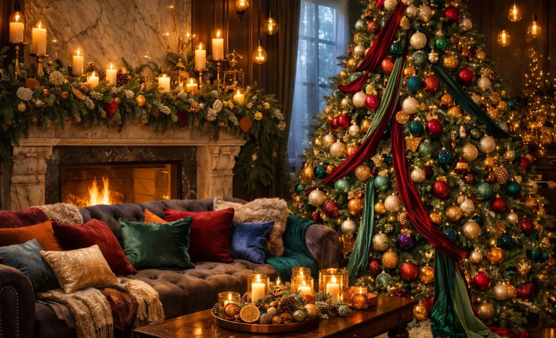
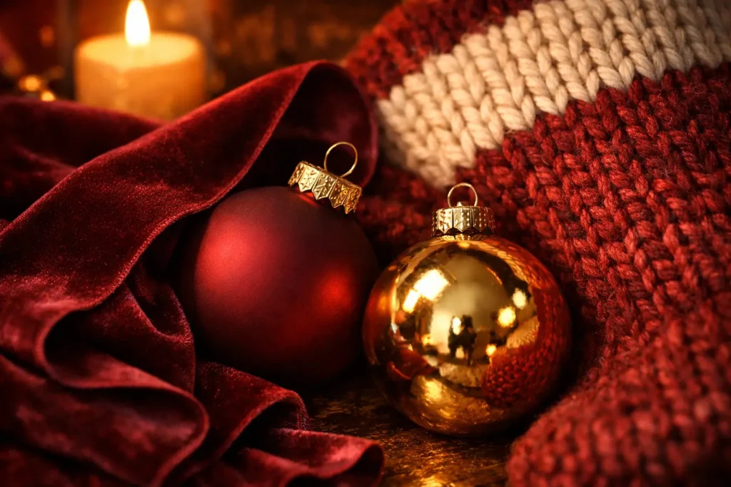
Velvet Burgundy and Merlot
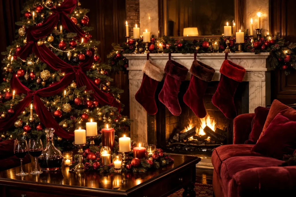
Velvet burgundy and merlot are the undisputed champions of Christmas 2026. This deep, wine-colored red looks expensive when paired with gold. Use it in stockings, ribbon accents, and tree skirts for an instantly elevated result. The key is pairing merlot with warm, burnished gold rather than bright yellow gold, which keeps the palette sophisticated rather than garish.
Sage and Pistachio Green
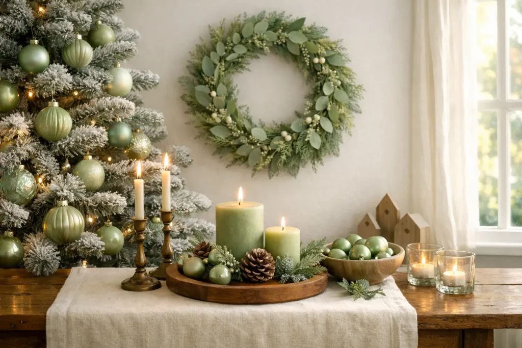
Green is staying, but it is moving toward softer, botanical herb tones rather than the hunter green of previous decades. Sage and pistachio feel fresh, restrained, and genuinely modern. These tones work brilliantly with cream, linen, and warm wood tones for a quietly luxurious aesthetic that does not try too hard.
Clementine as an Accent Color
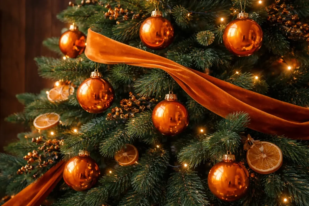
For those who want a modern twist, a bright citrus orange is being used as a surprising accent color against traditional evergreens. A single clementine ribbon or a cluster of orange glass baubles against deep green garland creates a visual jolt that feels both seasonal and unexpected.
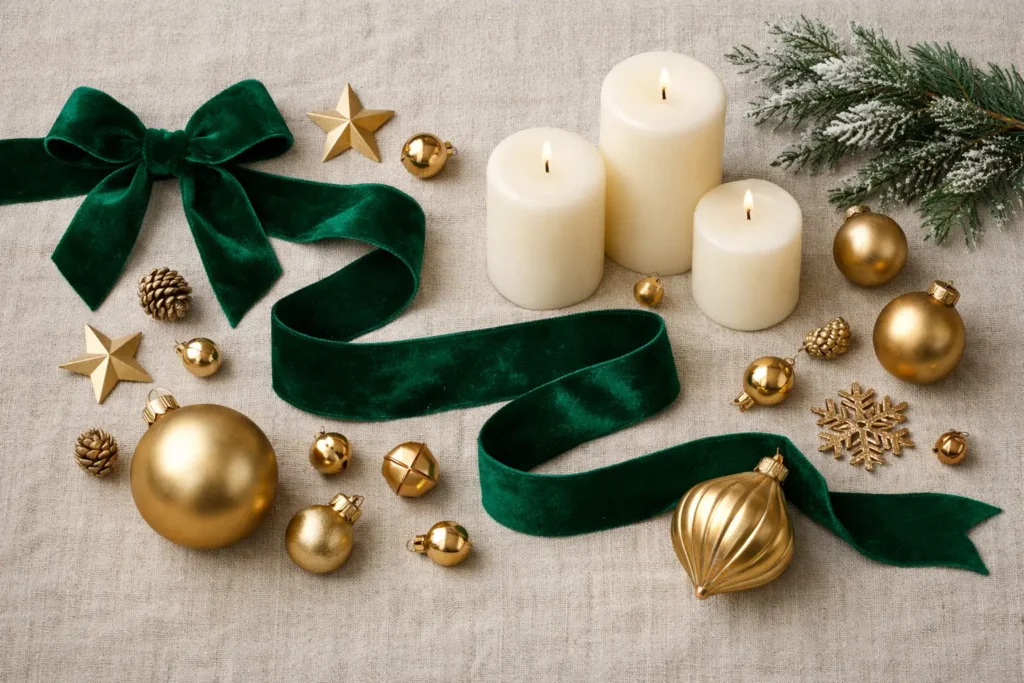
Jewel Tones Are the Mood of the Season
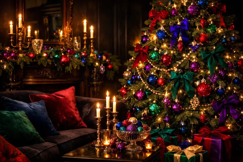
This year is all about depth, richness, and unexpected palettes that feel luxurious rather than typical. Jewel tones, candlelit warmth, and textures that beg to be touched are ruling the scene. Jewel tones bring a sense of drama and occasion that pastels and neutrals simply cannot achieve.
Deep Emerald and Brushed Gold
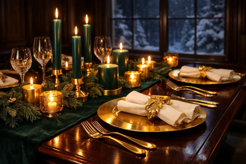
Navy blue, emerald green, and brushed gold create a palette that is mysterious, elegant, and full of depth, like a winter night sky. It is rich, moody, and impossible to take your eyes off. This combination suits luxury interiors and formal dining settings particularly well.
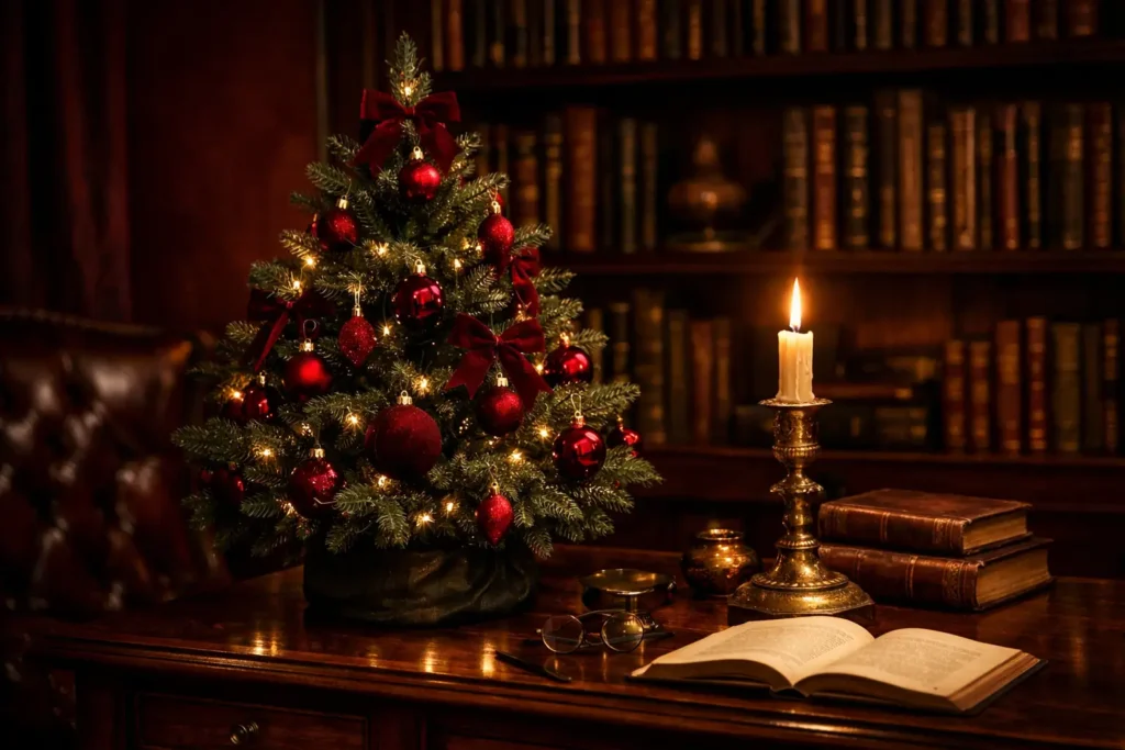
Forest Green and Matte Crimson
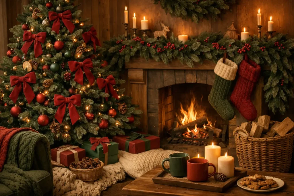
The traditional Christmas palette of forest green and matte crimson is being reimagined for modern taste. It is nostalgic, rich, and comfortingly familiar, but with better finishes and fewer visual clichés. Swap plastic reds and greens for velvet bows and knit textures to achieve that refined yet festive feel.
Cozy Earth Tones That Warm Every Room
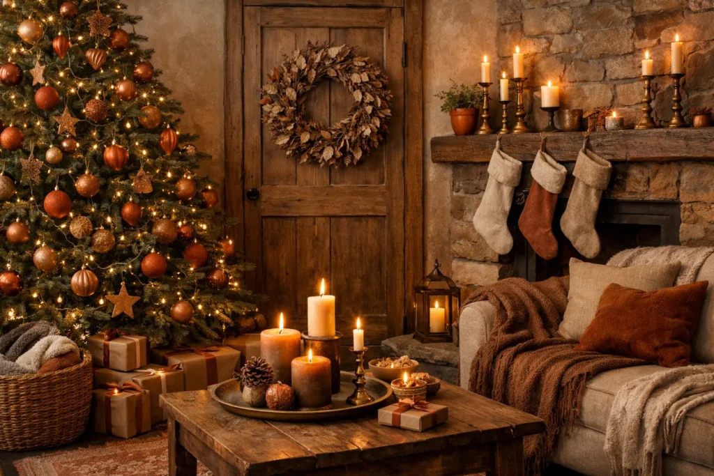
Not every Christmas palette needs to dazzle. Sometimes the most powerful design choice is one that simply feels like coming home. Earth tones are having their strongest season yet.
Mocha Mousse and Champagne Gold
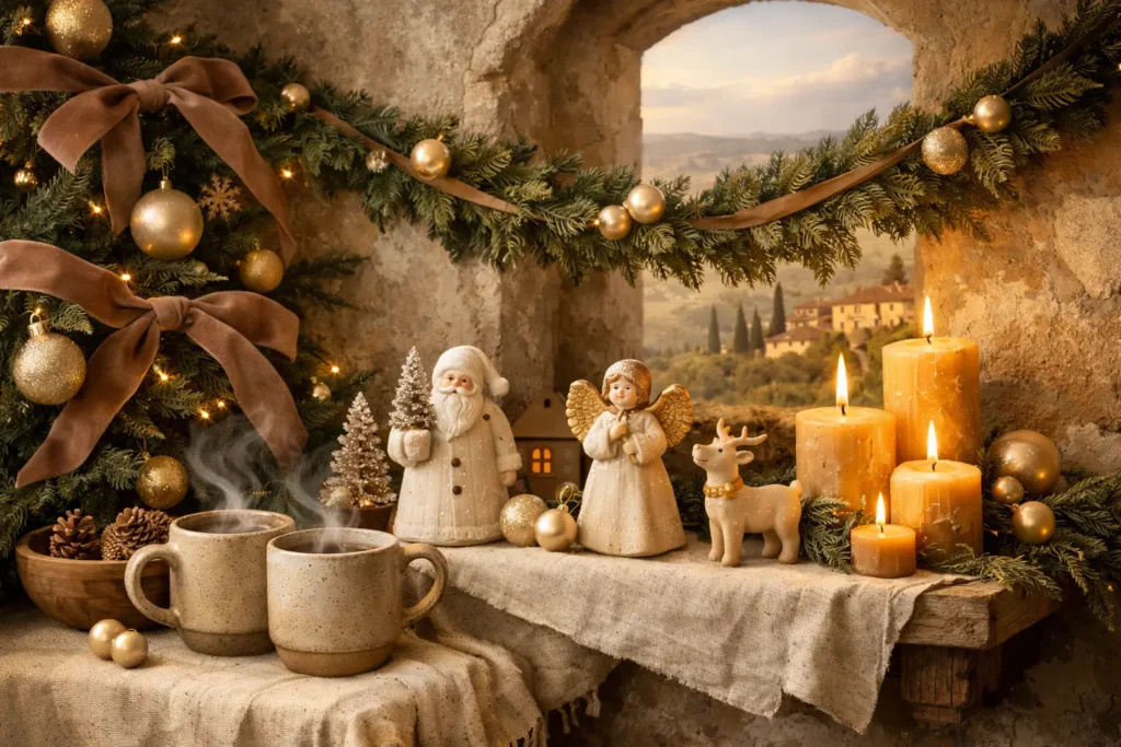
Mocha mousse, olive green, terracotta, and muted champagne gold represent sophisticated warmth, the cozy-meets-chic version of Christmas. Imagine velvet ribbons, ceramic ornaments, linen stockings, and golden candlelight flickering over stoneware. It is the palette that smells like cinnamon and feels like a weekend in the countryside.
Rich Chocolate Brown
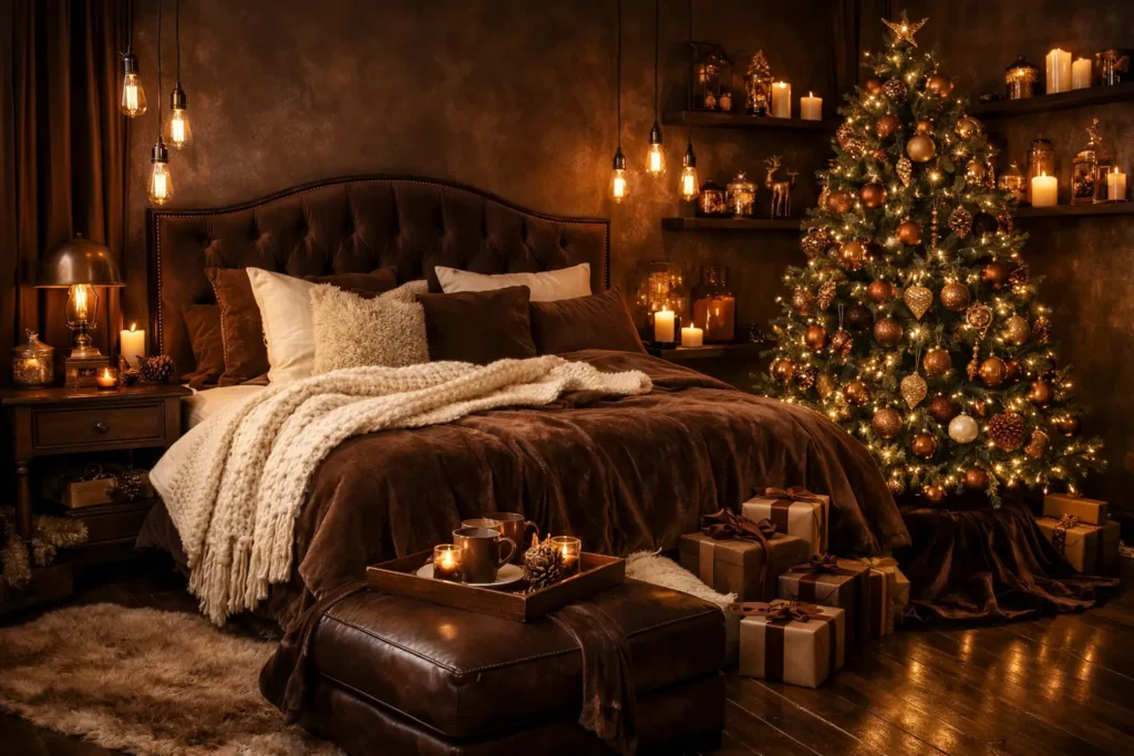
Browns feel cozy, grounding, and full of warmth, which is exactly what many designers want at Christmas this year. Benjamin Moore’s 2026 color of the year is a deep, luxurious brown with a soft charcoal undertone, giving it a sense of refined elegance, and it is perfect for creating an intimate, cozy, and high-end atmosphere.
Oxblood and Dark Wood
Oxblood, also called burgundy or maroon, has been one of the hottest colors in both home and fashion, and it is downright luxurious on stone surfaces and statement furniture pieces. Pairing a deep red with dark wood tones reduces the visual intensity while keeping the richness intact.
Frosted and Icy Tones for a Modern Christmas
For homes with a cleaner, more contemporary aesthetic, the cooler end of the 2026 palette offers an equally compelling story.
Icy Blue and Chrome Silver
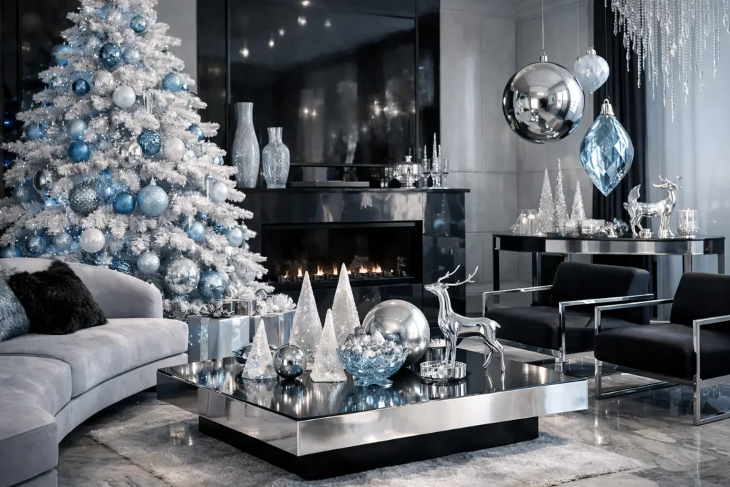
Matte black, icy blue, chrome silver, and snow white create a palette that is cool, sleek, and striking. This combination leans into a high-fashion approach to Christmas, one that feels more like an editorial shoot than a traditional family celebration, yet is no less festive for it.
Iridescent and Pearlescent Accents
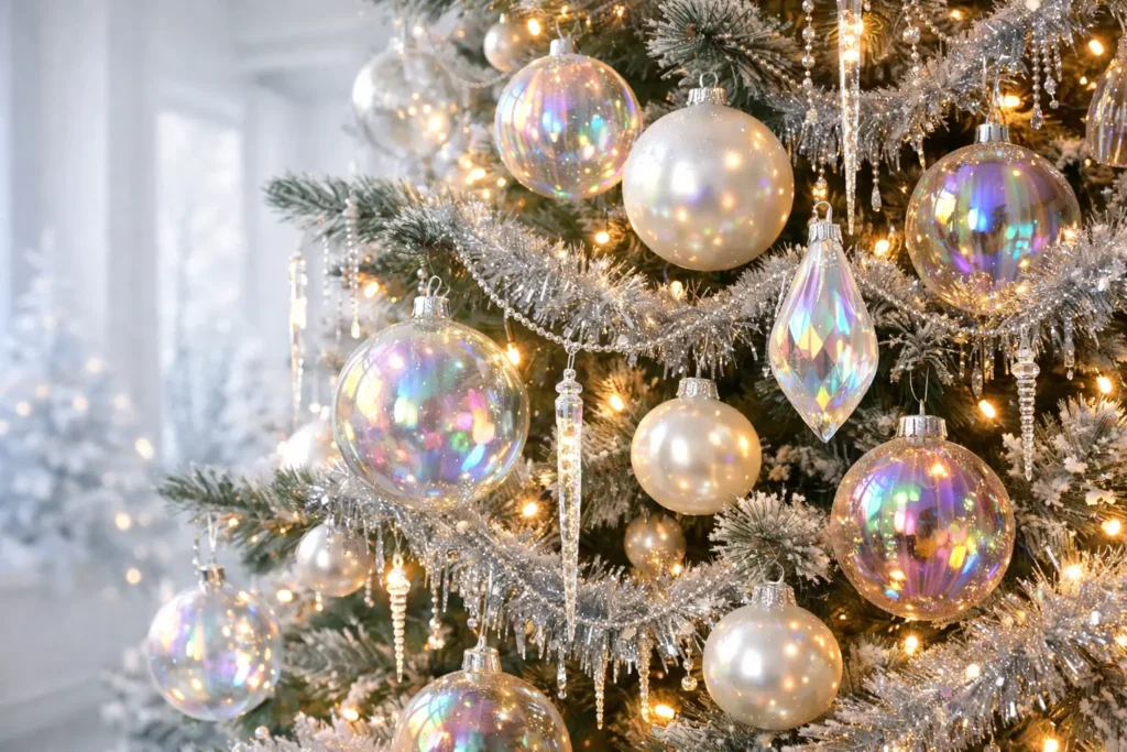
Transparent glass ornaments, iridescent tinsel, silver leafing, and icicle drop lights create a crisp, clean, and icy aesthetic inspired by the Arctic. These elements work best in spaces with white walls and minimal furniture, where each piece has room to catch the light.
Nature Inspired Palettes Rooted in Sustainability
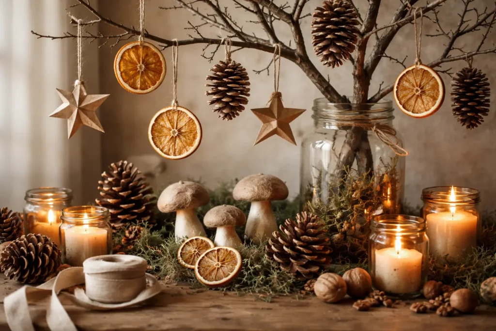
Sustainability is no longer a niche; it is a Christmas 2026 standard. The Botanical Hibernation approach focuses on bringing the outdoors in without synthetic materials, leaning into dried citrus slices, mushroom-shaped ornaments, oversized pinecones, and recycled paper stars.
Deep Fir Green and Moss
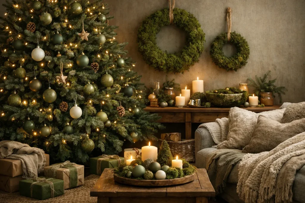
Deep shades of fir green and moss, complemented by warm natural colours and subtle accents, create a harmonious palette with a familiar, elegant look. Natural materials and calm surfaces define this style.
Warm Eucalyptus and Sage Slate
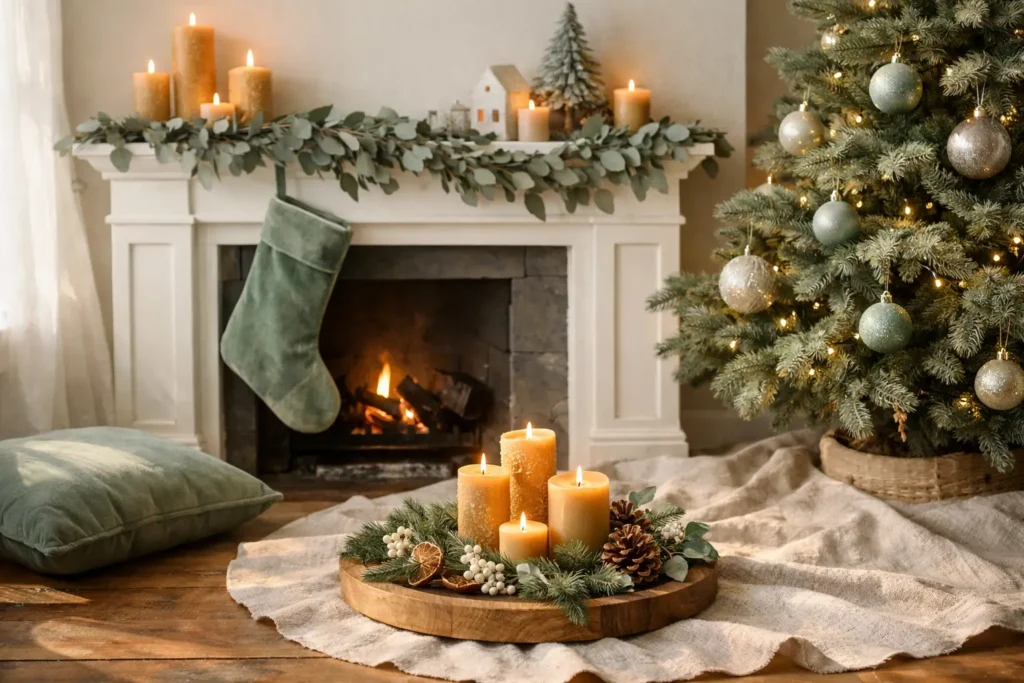
Valspar’s Color of the Year, “Warm Eucalyptus,” is a soft gray-green, like sun-dried leaves with a comforting earthy undertone. It is soothing and grounding, acting like a modern neutral and a great choice for mindful living. In Christmas settings, it pairs beautifully with raw linen, warm wood, and beeswax candles.
How to Combine These Colors Effectively
Knowing a trend and using it well are two different skills entirely.
Instead of juggling six shades, choose one statement hue and two or three supporting colors. Emerald green with gold and ivory feels rich and classic. Blush pink with rose gold and cream feels modern and romantic. The trick is balance: one bold, one neutral, one shimmer.
Texture as the Secret Ingredient
You can make any palette look luxurious with texture. Think velvet ribbons, metallic ornaments, satin bows, and wooden garlands. If your theme is minimalist, add softness through cozy fabrics. If it is glamorous, contrast sparkle with matte surfaces. Your Girl Knows That contrast is what prevents any palette from looking overdone.
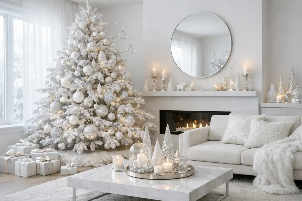
Ivory, Pearl Beige, and Frosted White
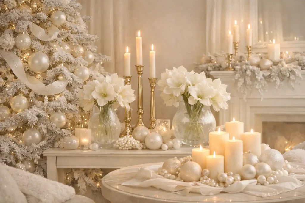
Ivory, pearl beige, champagne gold, and frosted glass white represent understated luxury, sparkling without shouting. It is the essence of quiet celebration: minimal, glowy, and utterly serene. This palette suits modern apartments and Scandinavian-inspired interiors flawlessly.
Transformative Teal
WGSN, an international trend forecasting company, named “Transformative Teal” the color of the year for 2026. After years of milky and cottage versions of blue and green, people are open again to complex shades that combine both. Teal works magnificently in Christmas settings against brass, gold, and ivory accents
Conclusion
Christmas 2026 is a season for thoughtful, layered, and deeply personal color choices. The trends this year are unified by one underlying desire: to create spaces that feel as good as they look. Whether you are drawn to the moody drama of velvet burgundy and midnight blue, the quiet dignity of mocha mousse and champagne gold, or the earthy calm of sage and warm eucalyptus, there is a palette here that speaks your language.
The best Christmas color story is always the one told with intention. Choose your anchor hue, layer in texture, let the candlelight do its work, and you will have a home that does not just look festive but genuinely feels like the most wonderful time of the year.
You can may also like this: Easy 18 Thanksgiving Table Decoration Ideas for a Cozy Feast
Frequently Asked Questions
What is the most popular Christmas color for 2026?
Velvet burgundy and merlot are considered the dominant Christmas colors for 2026. This deep, wine-toned red feels luxurious and pairs beautifully with gold, making it the top choice for decorators seeking an elevated holiday aesthetic.
Are traditional red and green still relevant for Christmas 2026?
Yes, but they have been reimagined. Bright plastic reds are out, while matte crimson and deep forest green paired with velvet and knit textures are very much in style. The palette is the same but the finish and feeling are entirely different.
What color palette works best for a cozy Christmas home in 2026?
Earth tones such as mocha mousse, terracotta, warm champagne gold, and chocolate brown work best for a cozy atmosphere. These shades pair well with natural materials like linen, wood, and beeswax candles to create warmth throughout a home.
How do I use jewel tones for Christmas without overdoing it?
Choose one jewel tone as your anchor color, such as emerald green or deep teal, and support it with two neutral or metallic shades like ivory and brushed gold. Keeping the jewel tone focused on key pieces like the tree, a statement wreath, or table linens prevents the space from feeling overwhelming.
Are icy and cool-toned Christmas colors still trending in 2026?
Yes, icy blue, chrome silver, frosted white, and iridescent accents remain a strong trend for 2026, particularly in modern and minimalist homes. These cooler tones create a crisp, high-fashion Christmas aesthetic that feels fresh and contemporary.