
Introduction
The exterior of your home is its first impression, and choosing the right color scheme can completely transform its character and curb appeal. Whether you live in a traditional cottage, a modern farmhouse, or a contemporary build, the colors you apply to your facade speak before anyone rings the doorbell.
A thoughtful exterior color scheme does more than just look attractive. It ties together architectural features, reflects your personal style, and even increases property value. With so many options available today, from warm earthy neutrals to deep moody tones, finding the right combination has never been more exciting.
This guide walks you through 22 stunning exterior color scheme ideas to help you create a home that stands out beautifully on any street.
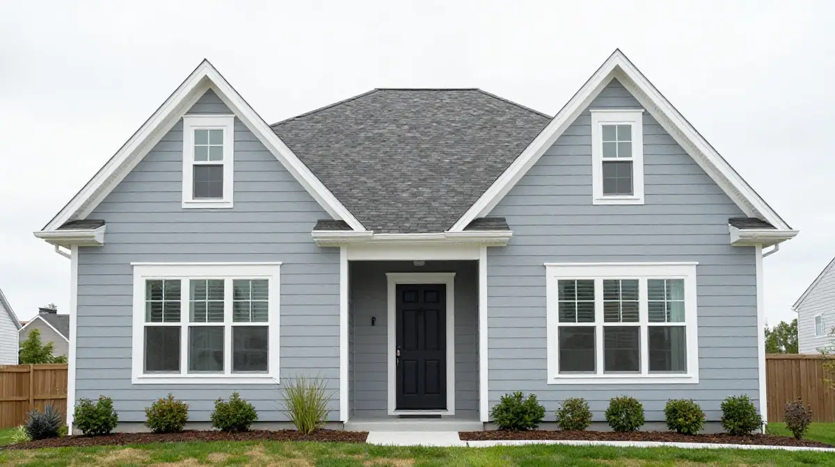
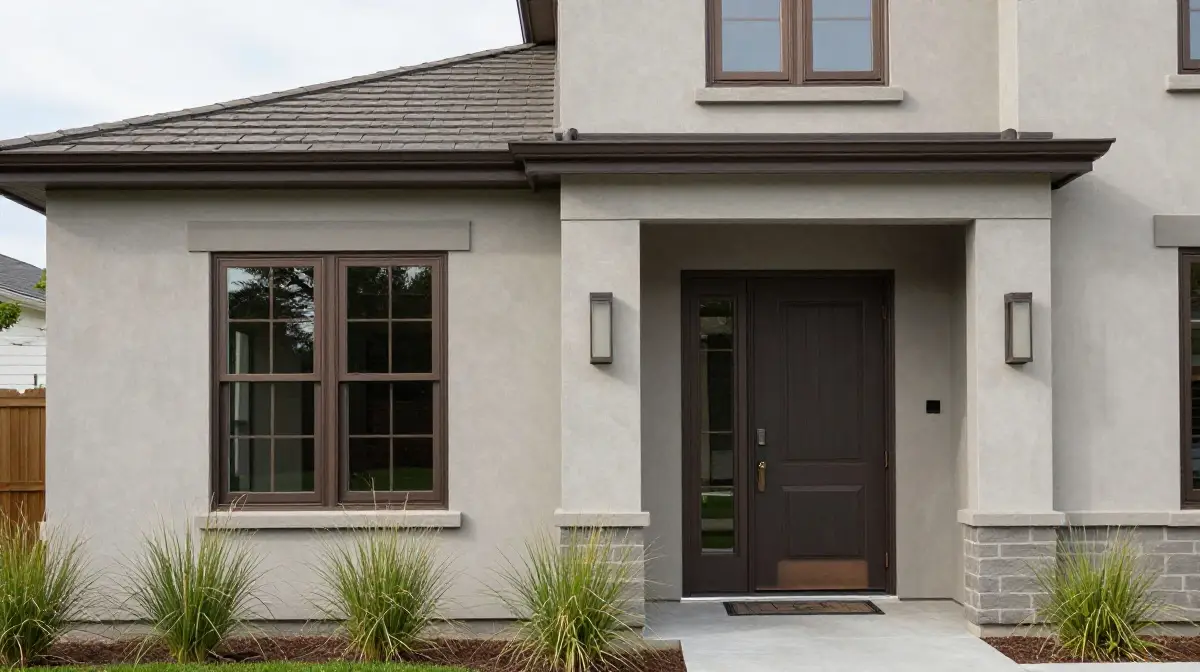
Classic White with Black Trim
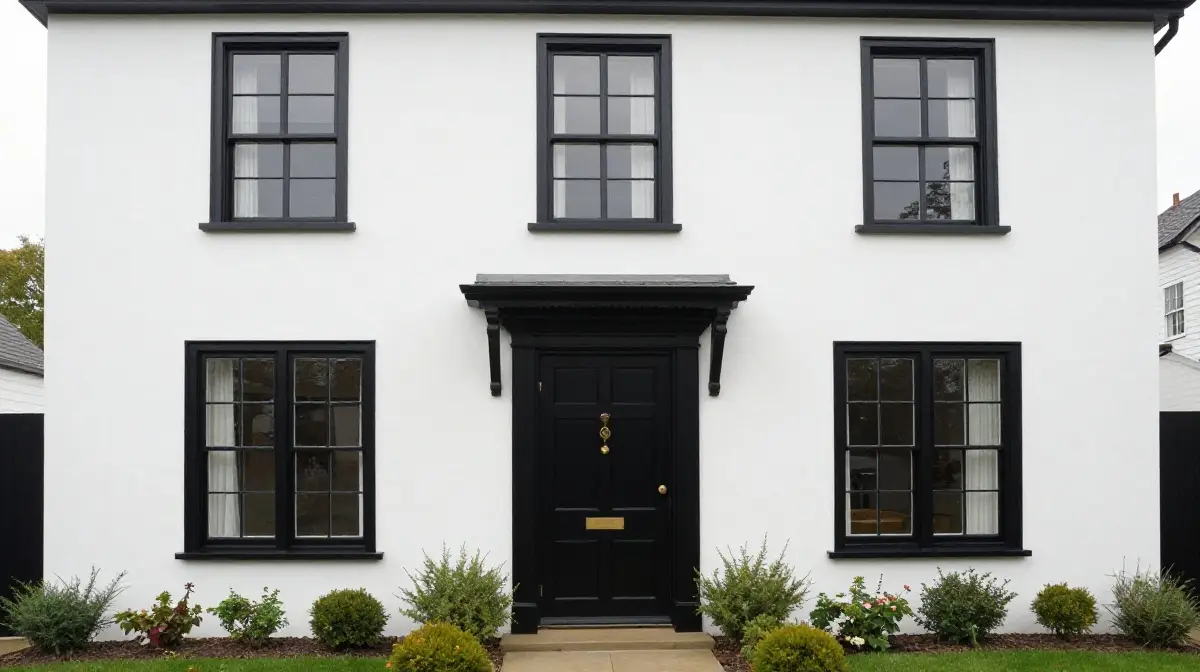
White has always held its place as one of the most timeless and universally appealing exterior color choices. It signals cleanliness, elegance, and a sense of spaciousness that few other shades can match. When paired with bold black trim around windows, doors, and eaves, white transforms from simple to dramatically sophisticated.
This high-contrast combination works exceptionally well on traditional, colonial, and modern farmhouse architectural styles. The black accents frame architectural features with precision, drawing the eye to every detail of the facade.
Adding a black front door with brushed brass hardware completes the look with a polished, editorial finish that never goes out of style.
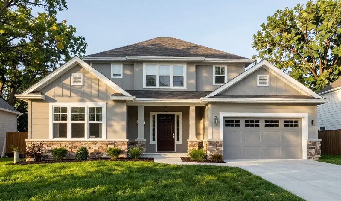
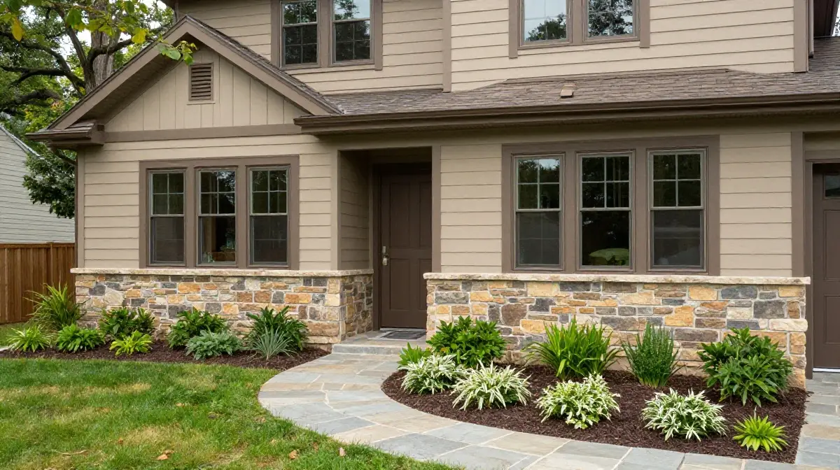
Warm Beige with Brown Accents
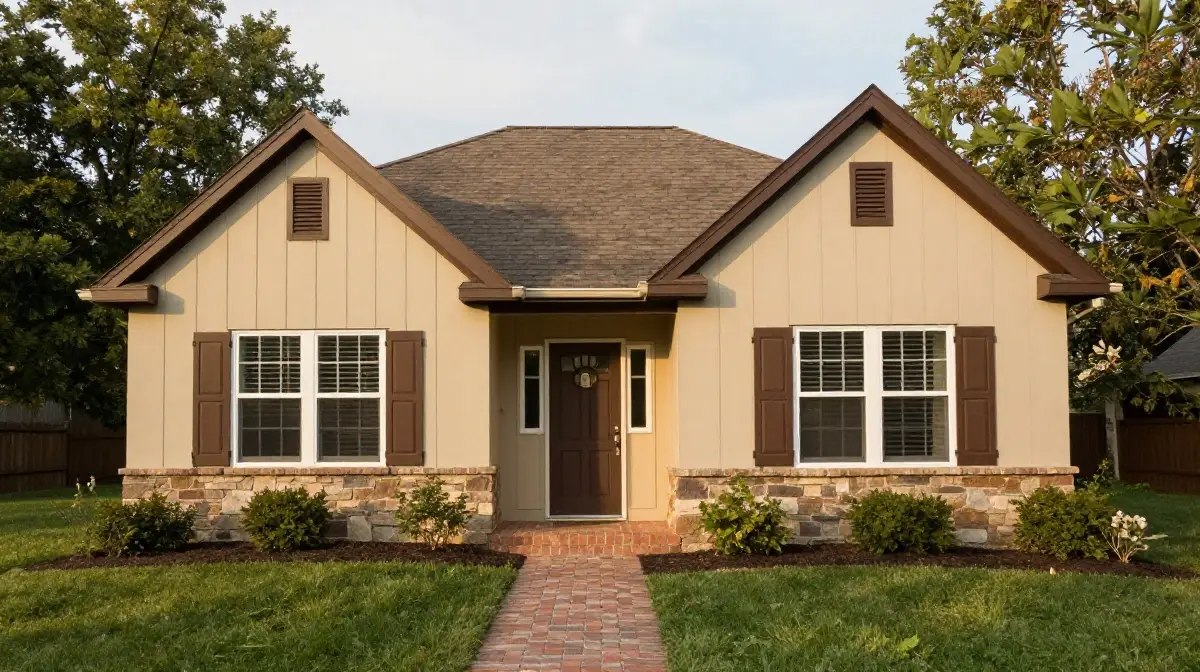
Beige is one of the most grounded and inviting tones you can apply to a home exterior. It sits comfortably between warm and neutral, making it highly versatile across different architectural styles and landscaping types.
When layered with rich brown accents on shutters, fascia boards, and garage doors, beige creates a cohesive, earthy aesthetic that feels both relaxed and refined. This combination complements brick foundations, natural stone pathways, and wood deck finishes beautifully. It also ages gracefully, resisting the visual fatigue that brighter or more trendy colors can develop over time.
For homeowners seeking a welcoming and low-maintenance look, warm beige with brown accents is a reliable and attractive choice.
Charcoal Gray with White Trim
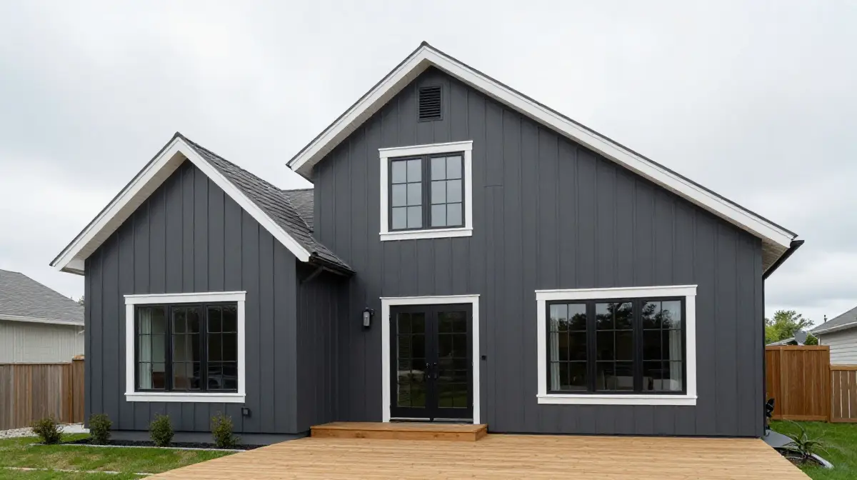
Charcoal gray has risen to become one of the most sought-after exterior colors in contemporary home design. It carries a sense of urban sophistication and quiet confidence that suits modern and transitional architectural styles particularly well.
When balanced with crisp white trim along rooflines, window surrounds, and porch columns, charcoal gray achieves a bold yet controlled visual statement. The contrast between dark and light elevates the overall structure of the home, giving it a defined and purposeful appearance.
Many homeowners pair this scheme with black windows and natural wood accents to add warmth and texture to what might otherwise feel too industrial. The result is a sleek exterior that feels current without being trendy.
Navy Blue with Crisp White
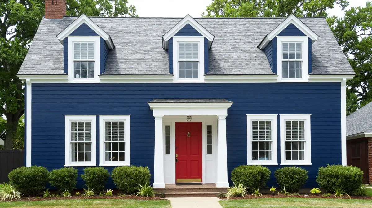
Navy blue brings a depth and richness to a home exterior that few colors can replicate. It is both commanding and approachable, making it ideal for homes that want to project character without resorting to shock tactics.
Paired with crisp white trim, navy creates a nautical-inspired scheme that works well in coastal settings but looks equally stunning in suburban neighborhoods and rural properties. The brightness of the white trim prevents the navy from feeling heavy or oppressive, keeping the facade feeling fresh and inviting throughout all seasons.
A red or brass front door adds a warm focal point that ties the whole scheme together. Benjamin Moore and Sherwin-Williams have both recognized blue as a dominant color trend in recent years for exactly these reasons.
Sage Green with Cream Trim
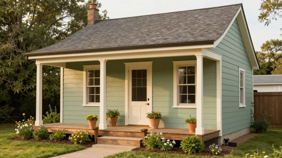
Sage green is one of the most nature-inspired and calming exterior color choices available today. It draws from the landscape itself, creating a seamless connection between the home and its surrounding environment.
When combined with warm cream or off-white trim, sage green achieves a softness and elegance that feels both current and enduringly classic. This combination is particularly effective on craftsman, cottage, and farmhouse style homes where organic, handcrafted aesthetics are already part of the architectural language.
The muted quality of sage green means it works in shaded garden settings as well as open, sun-drenched plots. Adding dark bronze or black hardware and fixtures creates a satisfying contrast that grounds the overall palette beautifully.
Terracotta with Sandy Beige
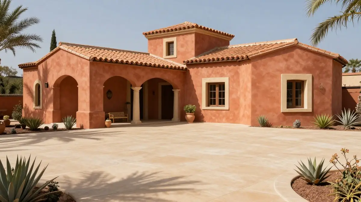
Terracotta is a warm, sun-baked tone that brings Mediterranean and Southwestern energy to a home exterior. It is rich, earthy, and deeply connected to natural materials like clay, sandstone, and adobe. When paired with sandy beige on trim, window surrounds, and decorative details, terracotta creates a warm tonal palette that feels both layered and harmonious.
This color scheme works especially well in warm climates where the natural light enhances the richness of the red-orange tones. It also complements terracotta roof tiles, wooden pergolas, and drought-resistant landscaping with native plants.
As earthy, nature-inspired tones continue to lead exterior design trends, terracotta paired with sandy beige sits at the very heart of what makes modern exterior styling so compelling.
Deep Forest Green with Black
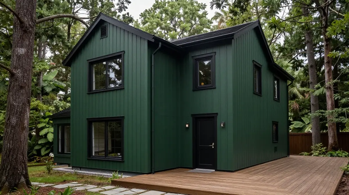
For homeowners who want their exterior to feel grounded, dramatic, and completely connected to nature, deep forest green is an outstanding choice. This is not a bright or saturated green but rather a dark, complex shade that evokes ancient woodland and quiet natural spaces.
When paired with black trim, window frames, and gutters, deep forest green becomes part of a moody and exceptionally stylish palette that has gained significant popularity in recent years. The combination works especially well on homes surrounded by mature trees and established gardens, where the exterior color essentially echoes the natural backdrop.
Wooden deck boards and stone pathways in neutral tones complement this scheme without competing with its inherent drama and depth.
Soft Gray with Blue Undertones
Soft gray with cool blue undertones offers an exterior color experience that feels calm, composed, and quietly luxurious. Unlike stark neutral grays, this shade carries just enough color to give the facade personality and distinction.
It works particularly well on homes with modern or transitional architecture where clean lines and restrained ornamentation define the overall design language. Pairing this tone with white or light silver trim keeps the exterior feeling airy and bright, while darker accents on the front door or window surrounds add the necessary visual depth.
This shade also photographs beautifully, which is an increasingly important consideration for homeowners who value both real-world curb appeal and online presentation in property listings.
Off-White with Warm Gray Accents
Off-white is one of the most versatile and enduringly popular exterior color choices precisely because it avoids the harshness of stark white while retaining all of its brightness and freshness. Shades like Alabaster, Greek Villa, and Creamy from leading paint brands have become household names among exterior designers for good reason.
When accented with warm gray on shutters, trim, and garage doors, off-white creates a layered, tonal scheme that feels sophisticated without being sterile. The warmth in both the base color and the accent prevents the scheme from feeling cold or clinical.
This combination complements virtually every architectural style and landscaping approach, making it an excellent choice for homeowners who want maximum flexibility and long-term appeal.
Bold Black with Natural Wood Tones
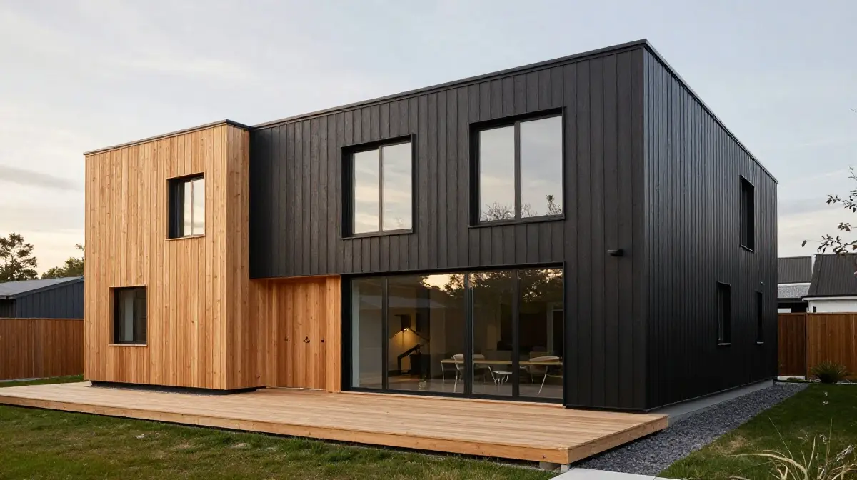
An all-black or near-black exterior is one of the most daring and architecturally striking choices a homeowner can make. When executed well, it creates a facade that is genuinely unforgettable and commands attention on any street.
The key to making a black exterior work lies in the materials and textures it is paired with. Natural cedar cladding, wooden deck boards, and raw timber features introduce warmth and organic texture that prevents the black from feeling oppressive or unwelcoming. Large windows allow natural light to interact with the dark surfaces in a way that adds visual interest throughout the day.
This combination has become particularly popular in Scandinavian-inspired and contemporary architecture, where simplicity and material honesty are central design values.
Dusty Blue with White
Dusty blue is a beautifully muted, slightly grayed shade of blue that brings a sense of calm and nostalgic charm to a home exterior. It sits between sky blue and slate, occupying a tonal space that feels both timeless and gently fashionable.
When paired with clean white trim, dusty blue creates a scheme that is soft, welcoming, and full of quiet character. It works particularly well on Victorian, craftsman, and cottage-style homes where period detailing and painted timber features are part of the architectural heritage.
A white front door with traditional paneling and brass fittings completes the look with understated elegance. This is a scheme that feels truly residential and human in the best possible sense.
Warm Taupe with Stone Accents
Taupe sits beautifully at the intersection of beige, gray, and brown, making it one of the most naturally harmonious exterior color choices available. Its complex undertones allow it to shift subtly with changing light conditions, giving the facade a sense of quiet depth that flat neutrals often lack.
When the lower sections of a home feature natural stone or brick in complementary warm tones, taupe siding creates a grounded, substantial aesthetic that feels genuinely rooted in its site. Adding darker taupe or bronze trim sharpens the overall composition without introducing jarring contrast.
This scheme is particularly effective on homes where materials such as fieldstone, slate, and reclaimed timber are already part of the structural vocabulary.
Pale Yellow with White
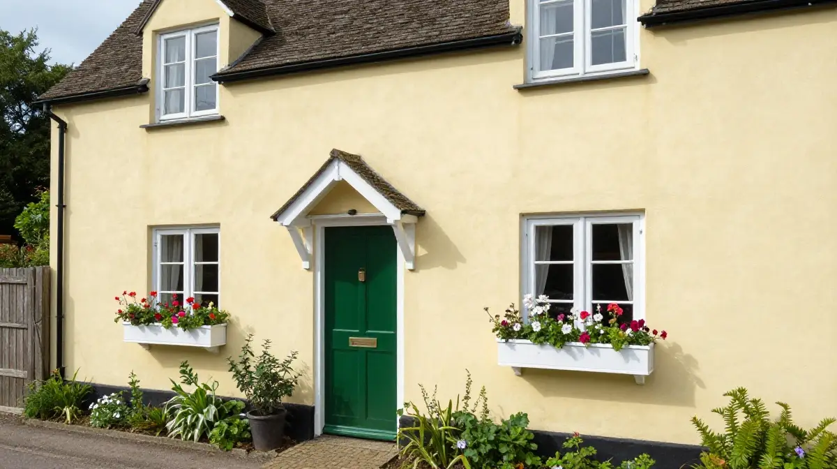
Pale yellow is one of the most cheerful and optimistic choices for a home exterior, bringing warmth and a sense of welcome to any streetscape. It recalls cottage gardens, country houses, and the kind of relaxed, sunlit living that many people aspire to.
Unlike saturated yellows, which can feel overpowering, pale yellow is gentle enough to avoid visual fatigue while still radiating warmth and personality.Paired with white trim, window boxes filled with seasonal blooms, and a painted front door in a complementary tone such as sage green or duck egg blue, this scheme achieves a genuine countryside elegance.
It works especially well on properties with mature gardens and established boundary planting that frames the facade with natural greenery.
Slate Blue with Gray
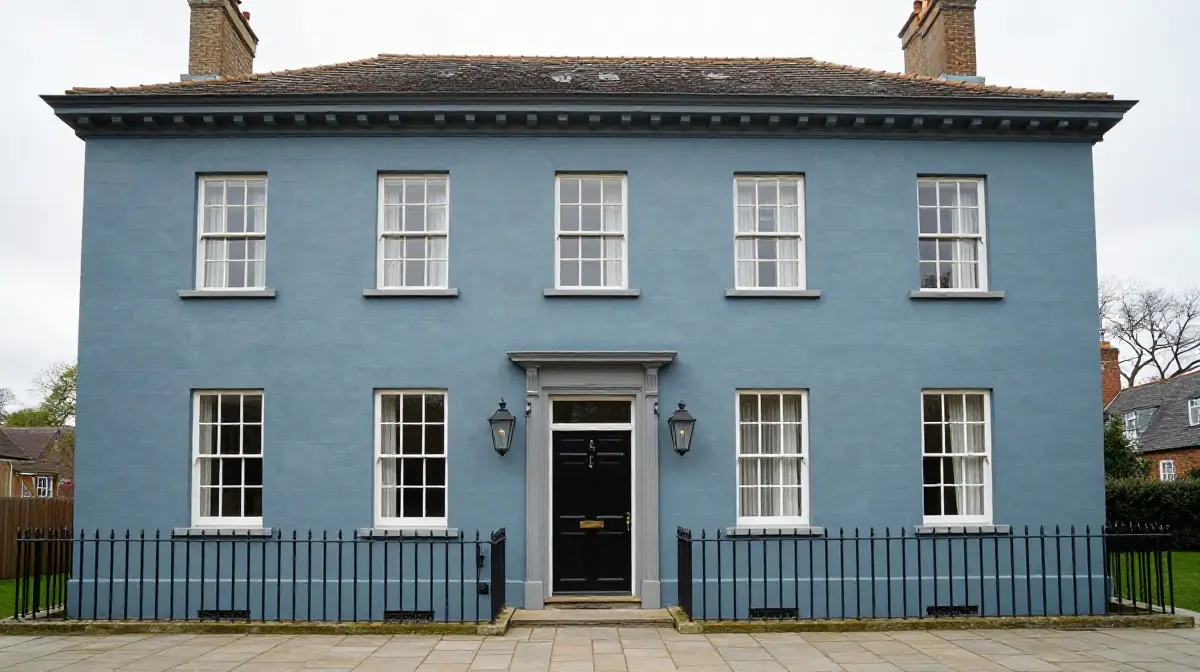
Slate blue is a sophisticated, historically informed exterior color that draws on centuries of architectural tradition, particularly in the context of Georgian, Victorian, and Edwardian homes. It is deeper and more complex than light blue, carrying charcoal and purple undertones that give it a sense of gravity and refinement.
When paired with warm or cool gray trim, slate blue creates an exterior palette that feels both considered and visually rich. The tonal relationship between slate blue and gray is subtle and layered, avoiding the sharp contrast of more contemporary combinations in favor of a more restrained, classical elegance.
Stone pathways, iron railings, and period-appropriate lanterns complete this scheme with historical authenticity and quiet confidence.
Rust Orange with Cream
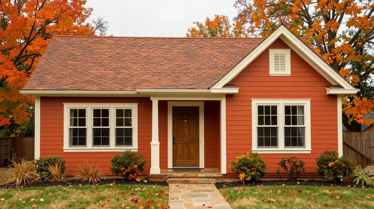
Rust orange is a deeply warm, autumnal tone that brings vibrancy and energy to a home exterior without crossing into the aggressive territory of bright red or orange. It echoes the colors of fired brick, dried leaves, and natural iron oxide, connecting the home to a deeply earthy and seasonal visual palette.
When paired with cream or ivory trim, rust orange achieves a richness and warmth that feels genuinely inviting throughout the colder months of the year. This combination works particularly well on homes that already feature brick or clay roof tiles, as the rust tone creates a natural visual continuity between wall, roof, and surrounding materials.
Wooden door frames and stone paths in warm neutrals complete this scheme with textured, natural appeal.
Greige with Dark Bronze Accents
Greige, the sophisticated blend of gray and beige, has become one of the defining exterior color choices of contemporary home design. It occupies a tonal space that is simultaneously warm and cool, giving it an unusual versatility that allows it to work across a wide range of architectural styles and settings.
When paired with dark bronze or oil-rubbed finish accents on window frames, front door hardware, gutters, and light fixtures, greige achieves a level of refinement and modernity that feels genuinely high-end. The dark bronze accents introduce a metallic warmth that prevents the greige from feeling too flat or anonymous.
This is a scheme that rewards close inspection, revealing more complexity and intentionality the more time you spend with it.
Cobalt Blue with White
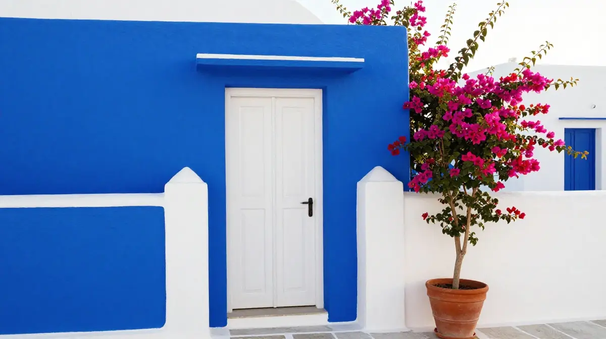
Cobalt blue is one of the most striking and confident exterior color choices available to homeowners who want their home to make a genuine statement. It is saturated, vivid, and deeply Mediterranean in character, recalling the whitewashed villages of the Greek islands and the painted shutters of coastal towns along the French Riviera.
When paired with crisp white trim and white-painted render, cobalt blue creates a contrast that is both festive and architecturally bold. This scheme works best on homes in warm, sunny climates where the intensity of the blue is softened and flattered by natural light.
A white front door and white-painted garden walls reinforce the theme and create a coherent, immersive exterior experience that is unlike almost anything else you will see on a residential street.
Olive Green with Tan
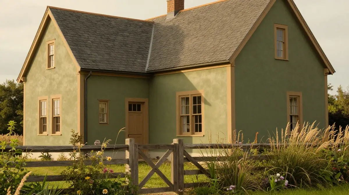
Olive green is a complex, slightly muted tone that combines the organic qualities of green with the warmth of yellow and brown undertones. It is one of the most nature-aligned exterior colors available, sitting beautifully against stone walls, wooden fences, and garden planting of almost any kind.
When paired with tan or warm caramel trim on fascias, window surrounds, and doors, olive green creates a harmonious, earthy palette that feels deeply connected to its landscape setting. This combination is particularly successful in rural and semi-rural contexts where the surrounding countryside provides a natural backdrop that the olive tone can engage with and complement.
It also works well on homes with clay or slate roof tiles, where the organic color palette extends naturally from wall to roof.
Blush Pink with Ivory
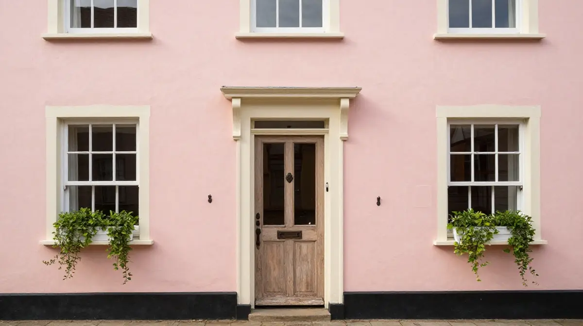
Blush pink may not be the first color that comes to mind when thinking about exterior schemes, but when handled with confidence and restraint it can produce a result that is genuinely enchanting. It brings a softness and romanticism to a home exterior that is entirely its own, distinct from any other color palette.
Paired with ivory or warm white trim, blush pink creates a scheme that feels delicate without being fussy, and feminine without being limiting. This combination works particularly well on smaller homes, cottages, and terraced houses where the scale of the facade suits a more intimate and personal color treatment.
Window boxes with trailing plants, a reclaimed wood front door, and antique iron fittings bring the look to its full potential with layered organic detail.
Dark Plum with Stone
Dark plum is an unexpected but deeply rewarding exterior color choice for homeowners who want their property to express genuine individuality and creative confidence. It is a rich, complex tone that combines the depth of purple with the warmth of red and the gravity of black.
When applied to a home that features natural stone elements, whether in a plinth, boundary wall, or chimney stack, dark plum creates a dramatic and historically resonant exterior palette. The warmth of the stone offsets the coolness of the plum, creating a visual tension that is both dynamic and sophisticated.
Cream or warm white painted trim prevents the scheme from becoming too heavy, while ensuring that architectural details remain clearly readable against the deep base color.
Light Gray with Yellow Door
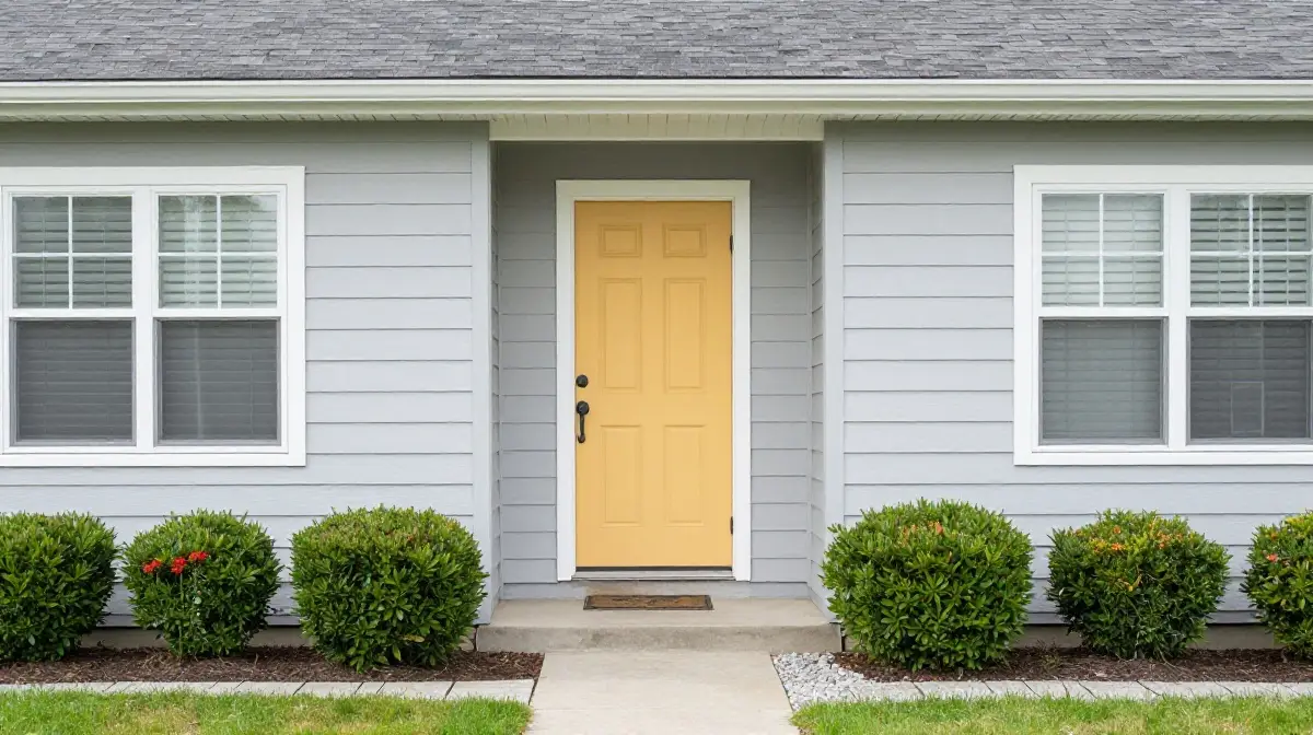
Light gray is one of the most intelligent and adaptable exterior base colors precisely because of how well it responds to accent color introductions. It provides a completely neutral canvas that allows other elements of the exterior such as the front door, window boxes, planters, and garden furniture to carry the visual weight of color.
A yellow front door, particularly in a warm mustard or sunflower tone, creates a focused and joyful focal point that brings the entire facade to life without requiring a full repaint. This approach allows homeowners to refresh the personality of their exterior simply by changing the accent color on the door as tastes evolve.
The combination of light gray and yellow is simultaneously modern and cheerful, appealing to a wide range of architectural styles and neighborhood contexts.
Two-Tone Exterior with Contrasting Upper and Lower
A two-tone exterior scheme divides the facade horizontally into two distinct color zones, typically a darker, more grounded tone on the lower portion and a lighter, brighter tone above. This approach adds visual dimension and architectural interest to homes that might otherwise read as flat or undifferentiated across their facade.
Popular combinations include deep charcoal below with pale stone above, navy blue with warm white, or dark forest green with cream. The horizontal division can be marked by a contrasting band of trim, a change in cladding material, or simply the natural shift at window sill height.
When executed well, a two-tone scheme gives even a modest home a sense of scale, proportion, and considered design intent that elevates its presence on the street considerably.
Conclusion
Choosing the right exterior color scheme is one of the most impactful decisions you can make for your home. As this guide demonstrates, the options range from timeless classics like white and black to more adventurous choices like cobalt blue and dark plum, with every possibility in between.
What matters most is not following a trend blindly but selecting a combination that works in harmony with your home’s architecture, its surrounding landscape, and your own personal sense of style. Consider how natural light affects your chosen tones throughout the day and across the seasons. Think about how your roof material, driveway, and garden planting interact with the wall color.
When all these elements align, the result is an exterior that feels genuinely complete and authentically yours. Take your time, test samples on the actual wall surface, and invest in quality exterior paint that will protect and beautify your home for years to come.
You may also like this:22 Front Yard Design Ideas for Stunning Curb Appeal
Frequently Asked Questions (FAQs)
1. What is the most popular exterior color scheme for homes right now?
Warm earthy neutrals continue to dominate exterior color trends. Shades like beige, sage green, warm taupe, and off-white are consistently among the top choices because they complement natural landscaping, age gracefully, and maintain broad appeal across architectural styles. Pairing these with dark accents on trim and doors adds the necessary visual contrast that keeps the overall look current and polished.
2. How do I choose the right exterior color scheme for my home’s architectural style?
Start by identifying your home’s architectural period and style, whether traditional, craftsman, colonial, modern, or contemporary. Each style has a historical color palette that tends to suit it best. A craftsman home responds well to earth tones and muted greens, while a modern home suits bold monochromes or dark charcoal schemes. Always consider the roof material, brickwork, and surrounding landscape when narrowing down your final choice.
3. How many colors should I use in an exterior color scheme?
Most designers recommend using no more than three colors in an exterior scheme: a dominant wall color, a trim color, and an accent color for the front door or shutters. This principle keeps the overall appearance cohesive and avoids visual clutter. Using too many colors fragments the facade and can make even a well-maintained home appear disorganized or poorly considered.
4. Does the exterior color affect my home’s resale value?
Yes, it can have a meaningful impact. Homes with well-chosen, broadly appealing exterior color schemes tend to attract more buyer interest and achieve stronger first impressions during property viewings. Neutral and classic combinations such as white with black trim or warm beige with brown accents tend to support resale value, while highly personal or unusual color choices can occasionally limit buyer appeal, depending on the local market.
5. Should the exterior color match the interior color palette?
There is no strict requirement for exterior and interior palettes to match, but a sense of tonal harmony between them creates a more cohesive overall experience, particularly in homes with large windows or open-plan interiors that create visual continuity between inside and outside. If your interior leans toward warm neutrals and natural materials, extending those tonal qualities to the exterior through warm beige, sage, or terracotta creates a satisfying and unified whole.

1 Comment