
Introduction
Not every home wants to announce the season with a burst of pink peonies and pastel throw pillows. Some homes want something quieter. A softer shift. The kind of spring update that you feel before you can fully identify what changed. That is the specific promise of neutral spring decor, and it is one of the most consistently underestimated approaches to seasonal refreshing available to any homeowner.
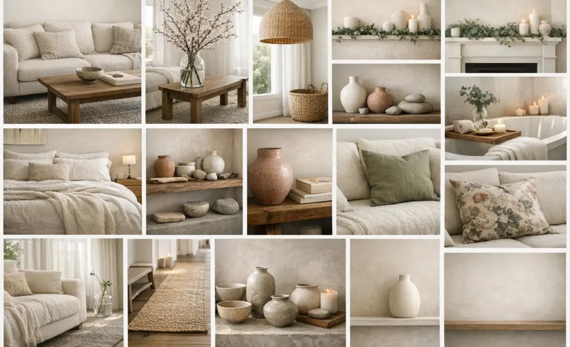
Creamy off-whites, pale sand, soft taupe, and gentle greige are colors that reflect light beautifully and create a serene backdrop. When you build a spring refresh on this foundation rather than around a seasonal color accent, the result is a home that feels genuinely lighter and more open without looking obviously decorated for the occasion. Muted mauves and earthy green tones, particularly pine and olive, anchored by warm browns and soft creams, are neutrals that can create a calming foundation for spring decor. The 16 neutral spring decor ideas in this guide cover every room, every budget, and every level of decorating experience with one consistent philosophy: softer is always better when the goal is a home that feels genuinely serene.
Build Your Foundation on Creamy Whites and Warm Greige
One of the biggest spring decor trends for 2026 is a move toward soft neutrals and warm whites. Creamy off-whites, pale sand, soft taupe, and gentle greige are colors that reflect light beautifully and create a serene backdrop. If your walls are currently a cool white or a stark bright white, the single most transformative neutral spring decor investment available to you is a repaint in a warm cream or greige. The warmth in these tones catches the longer spring light in a way that cool whites simply cannot replicate. For those who are not ready to repaint, introduce the warm white and greige palette through soft furnishing swaps: a new linen throw in warm cream, a greige cotton rug, or a set of cream ceramic vessels on an open shelf. The effect is immediate and requires no commitment to permanence.
Layer Textures Instead of Colors for Depth
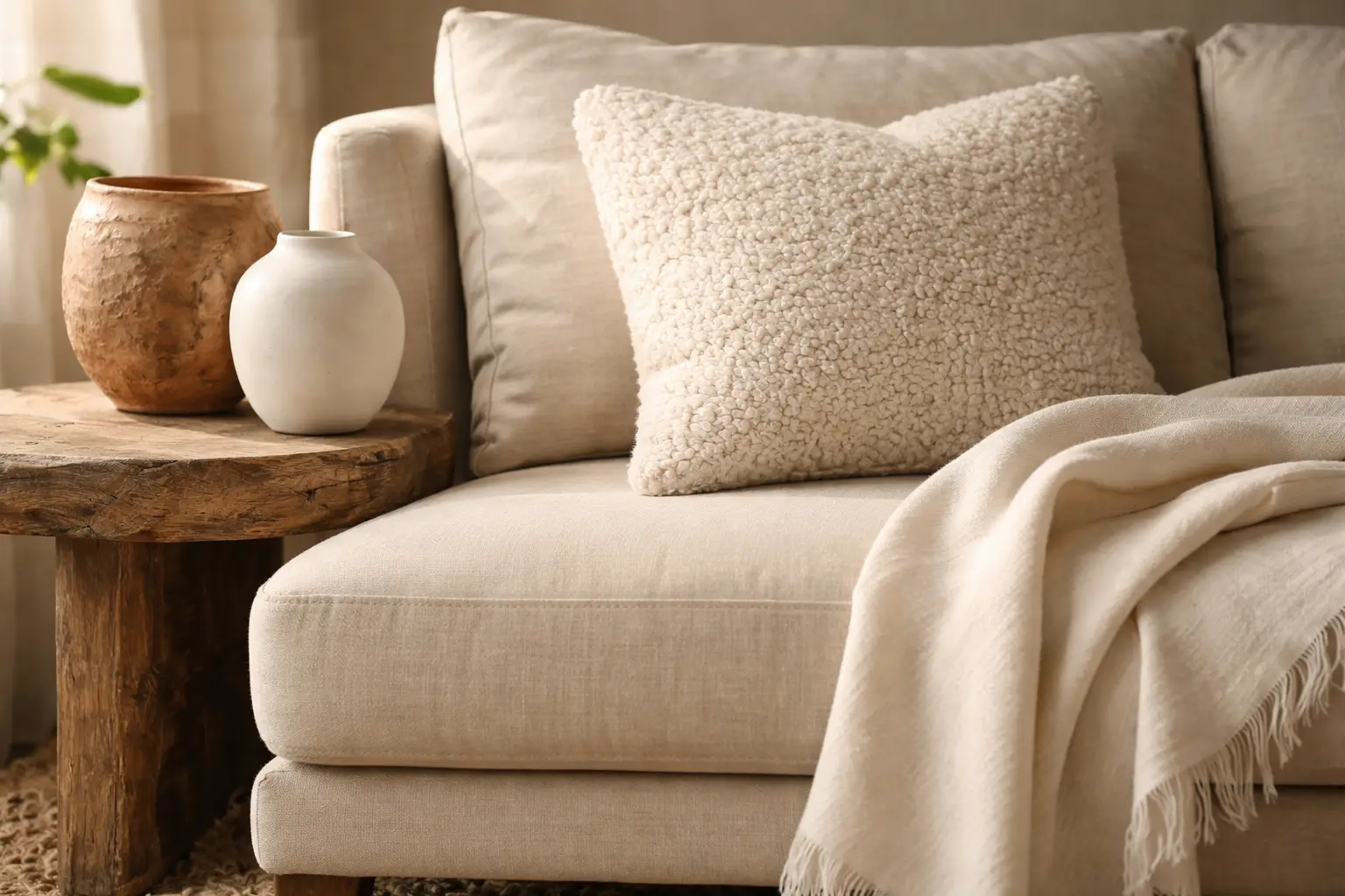
If you love neutrals, play with scale instead of color. Big florals, chunky arrangements, oversized decor in the same palette create more presence. This is the defining principle of successful neutral spring decor: when color is deliberately restrained, texture becomes the primary design tool. Layer a bouclé cushion beside a smooth linen one on the same sofa. Place a rough-textured terracotta pot beside a smooth ceramic vessel on the same shelf. Add a chunky jute rug beneath a smooth cotton throw on the same seating area. Think rich textures like cashmere or heavy linen, understated neutral tones, and investment pieces that feel timeless. It is a less is more approach that results in a space that feels sophisticated and deeply personal. The contrast between textures within a neutral palette creates visual interest that reads as sophisticated rather than seasonal.
Introduce Bare Branch Arrangements for Organic Spring Energy
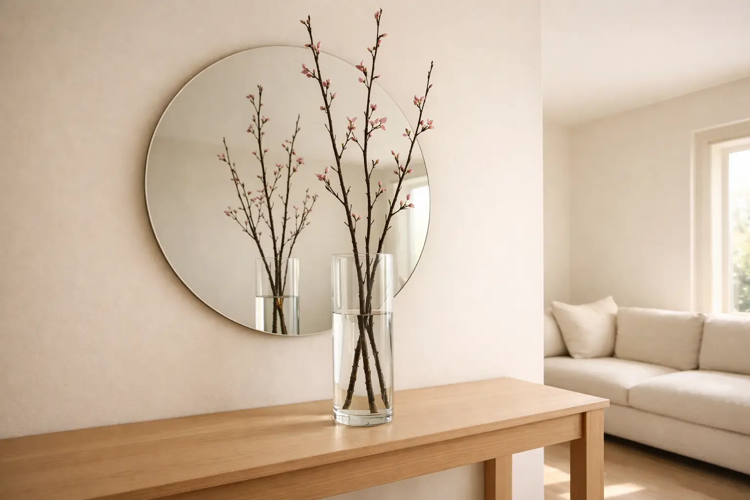
A black framed mirror, pale sofa, soft throws, and a tall branch arrangement in a clear glass vase. The contrast is clean and intentional. It does not rely on florals or pastels to feel seasonal. Instead, it brings in nature through bare branches and lets light and space do the rest. A single tall branch arrangement is the most beautifully restrained botanical element available for neutral spring decor. Use cherry blossom branches, quince branches, or simply foraged branches from the garden placed in a tall clear glass vase or a slender ceramic cylinder. The spare, architectural quality of a branch arrangement communicates the spirit of spring in its earliest and most delicate form without introducing a single pastel or brightly colored element into the space.
Choose Warm Metals Over Cold Chrome
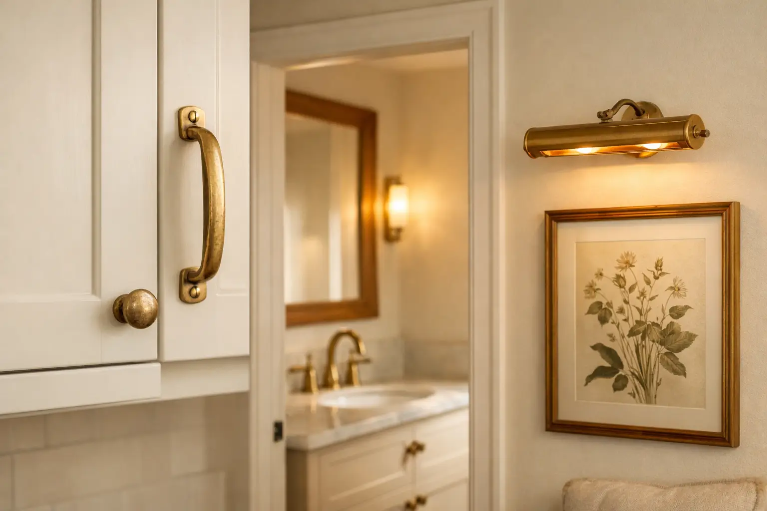
For spring, we are saying goodbye to cold chrome, which is being replaced by warmer, softer-looking metals like nickel and unlacquered brass, marking a return of quietly considered and elegant interiors. This single material swap has an outsized impact on the overall warmth and softness of a neutral interior. Replace cold chrome cabinet hardware with unlacquered brass. Swap a chrome faucet for a brushed nickel version. Add a warm brass picture light above a piece of artwork. The aged and imperfect quality of unlacquered brass and the soft luster of brushed nickel both contribute warmth that works specifically with the creamy and greige neutral palettes most suited to a soft spring look.
Rattan and Seagrass for Natural Woven Warmth
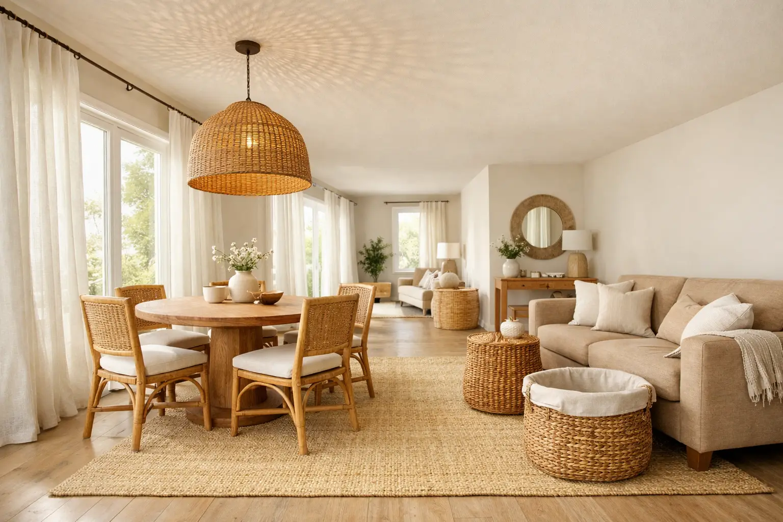
Expect to see a lot of rattan, wicker, and seagrass this season. In keeping with the theme of spring growth and renewal, pairing these textures with accent pieces inspired by nature can evoke a popular coastal-chic aesthetic. The warm honey tones of rattan and the pale straw tones of seagrass are naturally neutral and naturally spring in their visual quality. A rattan side table, a seagrass storage basket, a woven wicker pendant light, or a seagrass area rug all introduce the natural woven texture without contributing any color accent that might disrupt a carefully curated neutral palette. Once reserved for the patio, wicker is making a major comeback in the primary living areas of the home. Its woven texture adds immediate warmth and a coastal vacation quality to any room.
Style a Neutral Spring Mantel with Restrained Simplicity
This mantel shows how neutral tones can still feel seasonal. A large green wreath placed against the decorative wood frame immediately signals spring. The surrounding pieces, ceramic pitchers, soft pink flowers, and small plants, create layers without making the shelf feel crowded. A neutral spring mantel uses no more than five elements: a large round mirror as a backdrop, a single organic element such as a branch arrangement or a loose eucalyptus garland, one pair of ceramic vessels in cream or terracotta, and one lit candle in a simple holder. This setup features white candles, small plants, and birdcage accents that create balance without filling every inch of space. The large wooden clock anchors the composition and gives the wall presence. The greenery sits low in a tray so the display stays clean instead of crowded.
Refresh Bedroom Textiles with Linen in Warm Neutrals
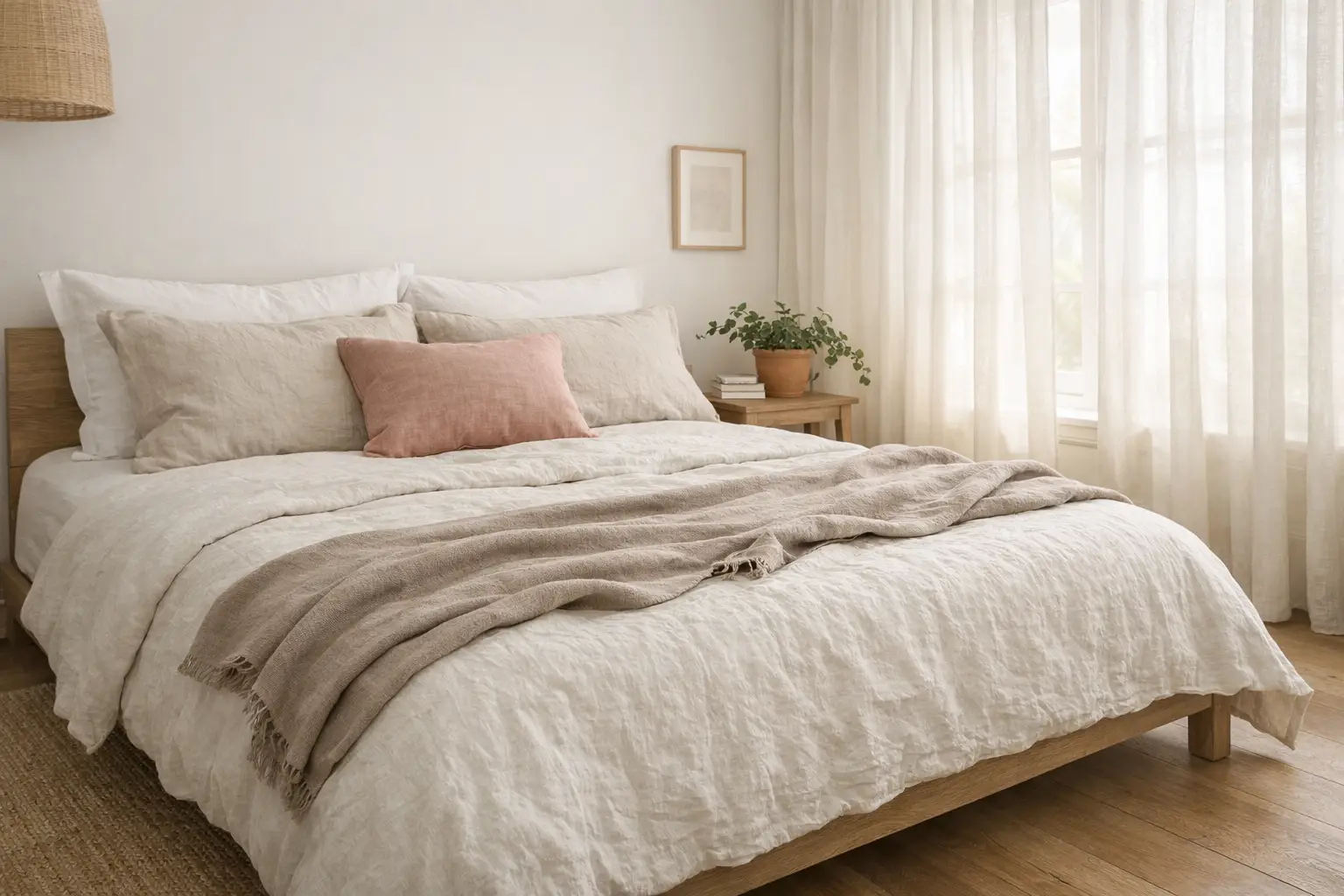
Crisp white or soft neutral bedding paired with a quilt or coverlet instantly refreshes the room. These spaces feel intentionally calm, perfect for transitioning out of winter and into longer, brighter days. The neutral spring bedroom is built on a foundation of washed linen in warm white, pale sand, or soft taupe. Replace the winter duvet cover with a linen quilt in warm white. Add pillow shams in pale sand linen. Layer a lightweight cotton throw in soft taupe at the foot of the bed. The washed linen texture communicates spring instantly through its relaxed and naturally crumpled quality without introducing a single seasonal color. A terracotta pot with a small plant on the bedside table is the only botanical accent the neutral spring bedroom needs.
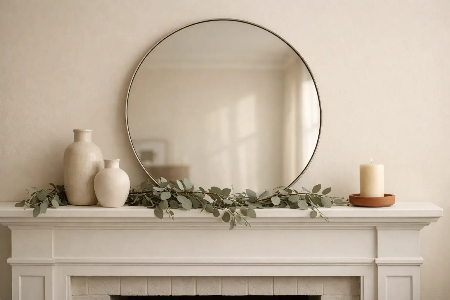
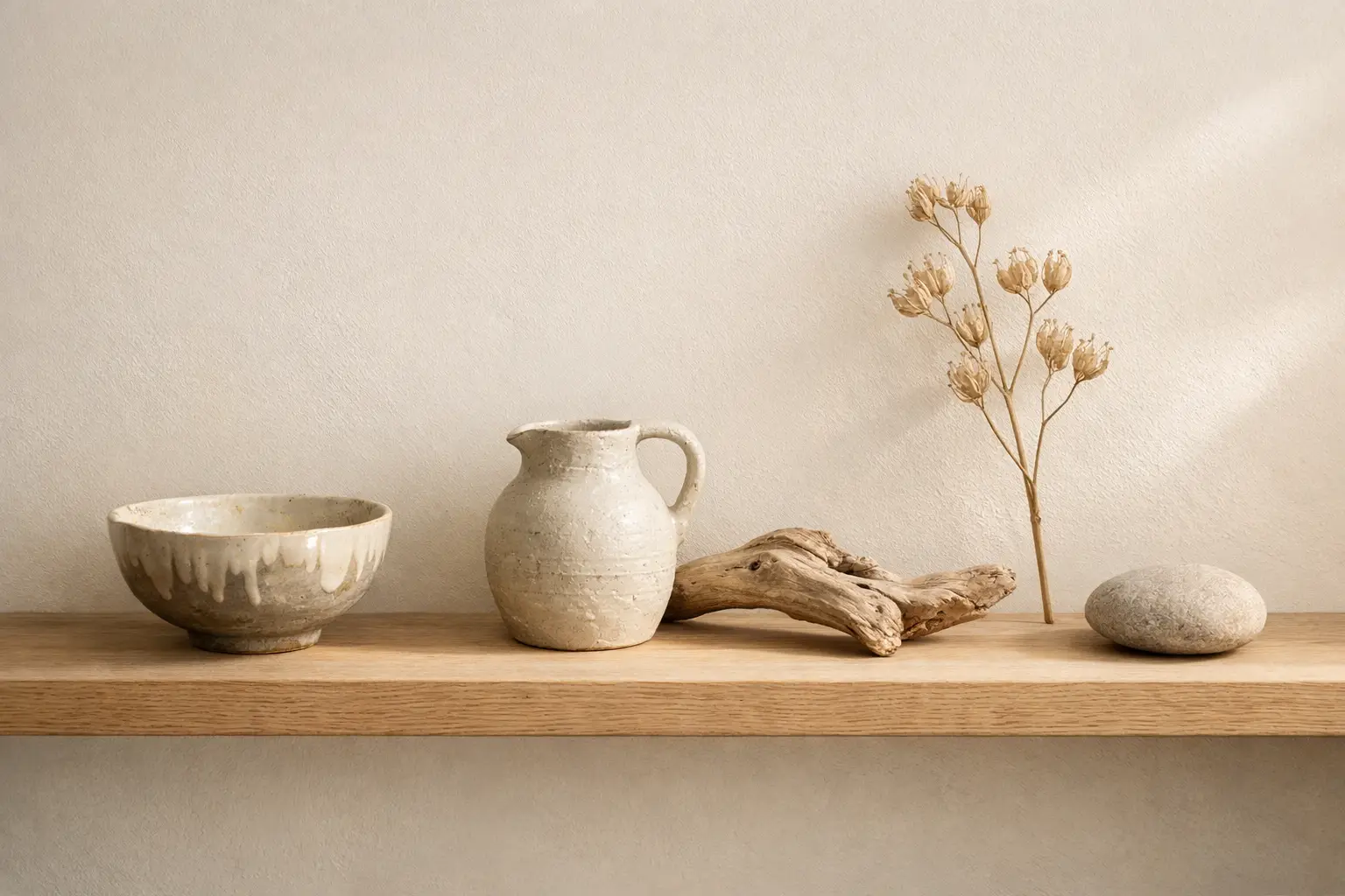
Create Shelf Vignettes Using Natural and Organic Objects
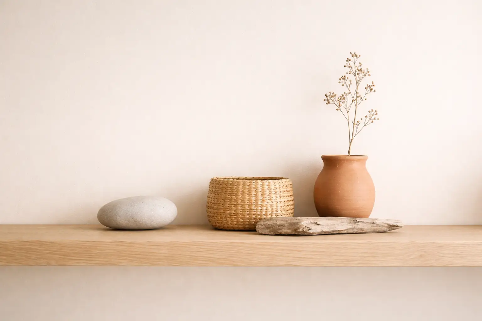
Natural materials, soft neutrals, and meaningful details bring their own lightness. Let texture carry the look. It is the kind of styling that works beautifully on a console or open shelf. Spring decor does not have to be pastel to feel fresh. A neutral spring shelf vignette is built from objects found in nature or inspired by it: smooth river stones, dried seed pods, woven baskets, unglazed terracotta, raw wood, and dried botanical stems. Carved wood, a classic mirror, stacked green books, and a ceramic lamp with a soft white shade feel like a vignette that has been there for generations. The muted greens and natural wood tones whisper spring without shouting it. Keep the color story of every vignette within a single neutral family and vary the textures and heights rather than the colors for the most sophisticated result.
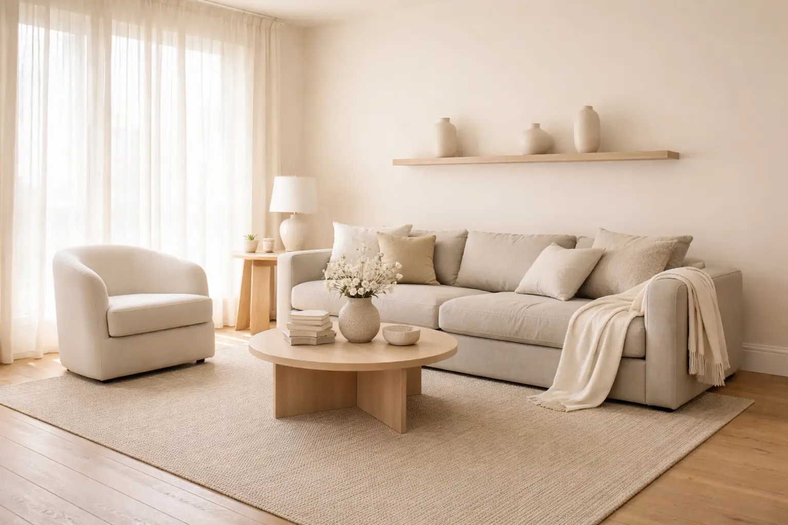
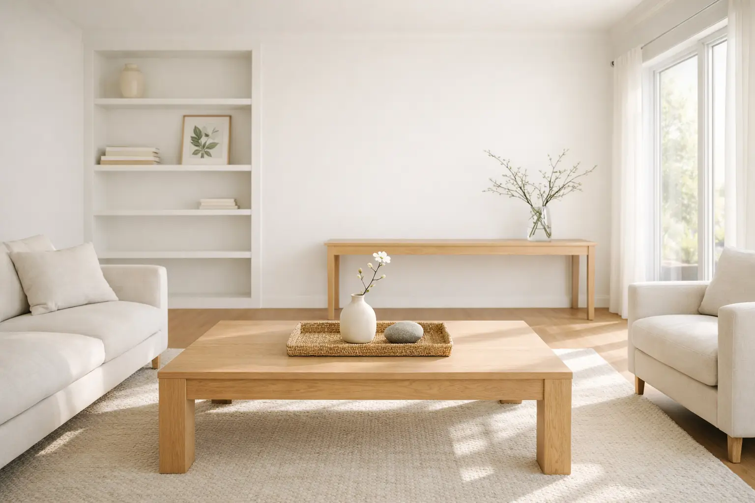
Use Soft Cream and Sand Tones in the Living Room
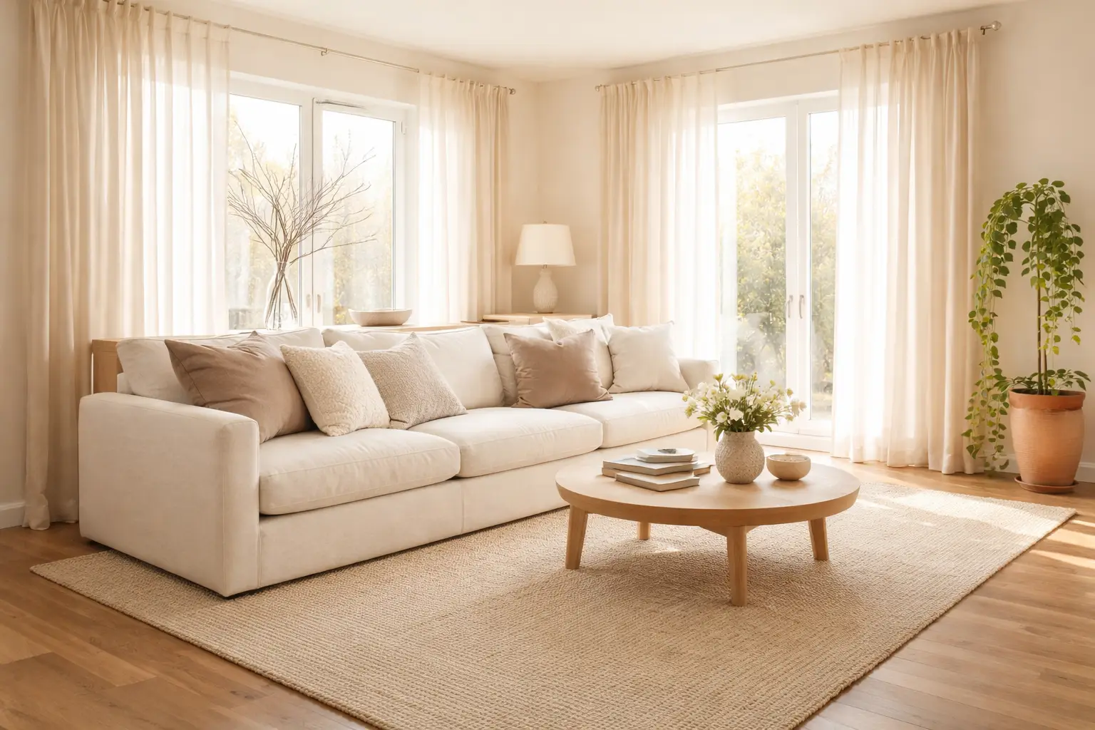
This space leans fully into creamy whites and soft textures, and that oversized hydrangea wreath provides an instant spring statement. Layered pillows in the same tone keep it cohesive while adding depth. A neutral spring living room uses a cream sofa or a greige sofa as the anchor, with throw pillows in varying textures of cream, warm white, pale sand, and soft taupe layered across it. The key to a neutral living room that reads as spring rather than winter is the introduction of natural light through sheer linen curtains replacing heavier winter drapes, and the placement of at least one living botanical element such as a trailing plant or a branch arrangement in a clear glass vase. Butter yellows and other gentle spring hues are layered in as seasonal accents, building on momentum from last year rather than introducing abrupt shifts.
Soft Dusty Pink as a Neutral Spring Accent
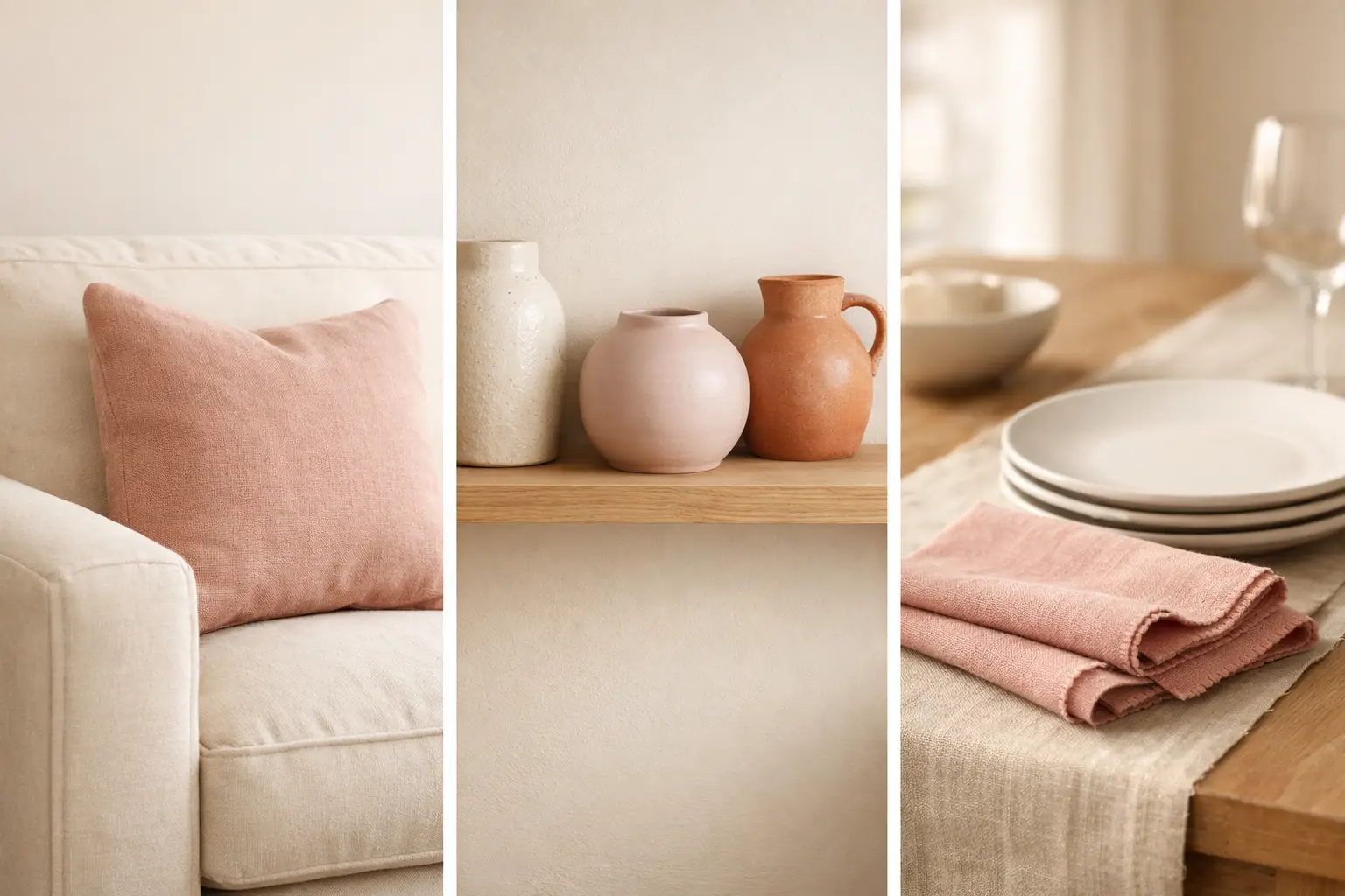
A great paint selection to freshen up your space is Benjamin Moore’s Morristown Cream, which is the perfect dusty, soft pink that still feels like a neutral. You can also layer in a mix of muted pinks and warm brown tones with textiles. It is a super simple refresh that makes your home feel luxe and cozy. Dusty pink occupies a unique position in the neutral spring palette: it reads as warm and slightly seasonal while remaining firmly within the neutral color story rather than the brightly colored one. Introduce it through a linen pillow cover in muted rose, a soft dusty pink ceramic vessel, or a set of pale blush napkins on the dining table. Paired with warm whites and natural wood tones, dusty pink creates a spring warmth that feels genuinely sophisticated rather than obviously seasonal.
Incorporate Muted Olive and Pine Green as Earthy Accents
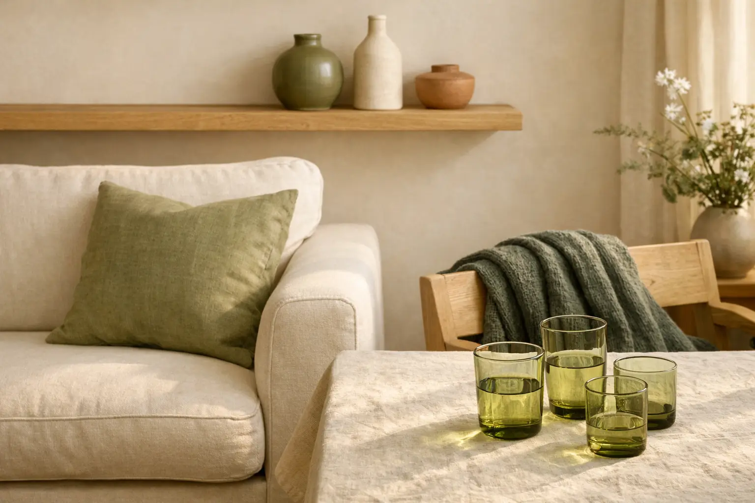
Earthy green tones, particularly pine and olive, anchored by warm browns and soft creams, are neutrals that can create a calming foundation for spring decor. Unlike bright sage or vivid emerald, muted olive and pine green read as neutral earthy tones that belong in a restrained spring palette as naturally as terracotta or warm sand. Introduce olive green through a linen cushion cover, a woven throw, a ceramic vessel in a matte olive glaze, or a set of water glasses in olive-tinted glass. These muted greens work especially well in rooms with warm wood tones and cream walls because they reference the deepest and most earthy quality of spring foliage rather than its brightest.
Heritage Florals and Painterly Textiles for Quiet Pattern
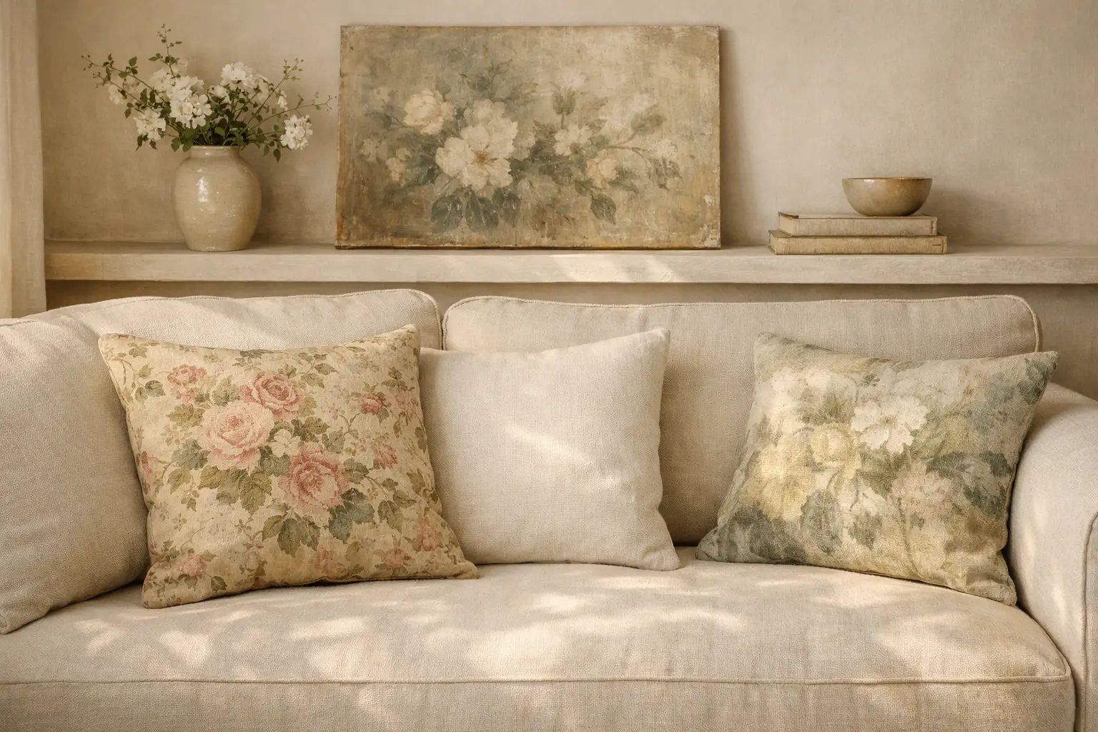
Heritage florals and painterly textiles are layered against creamy neutrals, creating a quiet foundation for richer, moodier accents to emerge. Deep and sage greens are leading the palette, bringing a grounded, botanical depth, while earthy ochres add warmth and sun-washed optimism. A heritage floral cushion in a muted and faded colorway laid against a cream sofa introduces the idea of spring florals without the brightness of a fresh floral pattern. Look for botanical prints where the colors appear sun-washed and aged, where the greens are olive rather than bright, and where the background is cream or warm white rather than stark white. These painterly and heritage floral textiles are the most consistently sophisticated way to introduce botanical pattern into a neutral spring interior.
Neutral Spring Entry Way with Woven Textures and Greenery
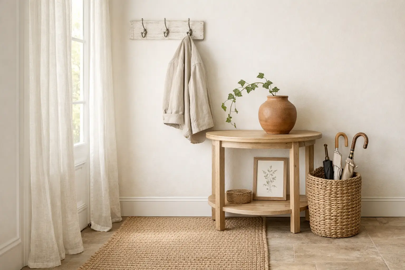
Entryways benefit from light runners, woven baskets, and a touch of greenery or fresh flowers. Spring is the perfect time to refresh your home’s first impression. A neutral spring entry way uses a flat-weave jute or seagrass runner on the floor, a woven basket for umbrellas or everyday items, a small ceramic vessel with a single stem or a small trailing plant on the entry table, and sheer linen panels on any entry window allowing maximum spring light in. Keep every element within the warm neutral palette of cream, sand, natural wood, and seagrass, and the entry way will communicate the softer spring look the moment anyone steps through the door. A distressed white ladder becomes the perfect backdrop for woven baskets and blush hydrangeas. The palette stays neutral, cream, sand, soft peach, letting the textures carry the story.
Spa-Inspired Neutral Spring Bathroom Updates
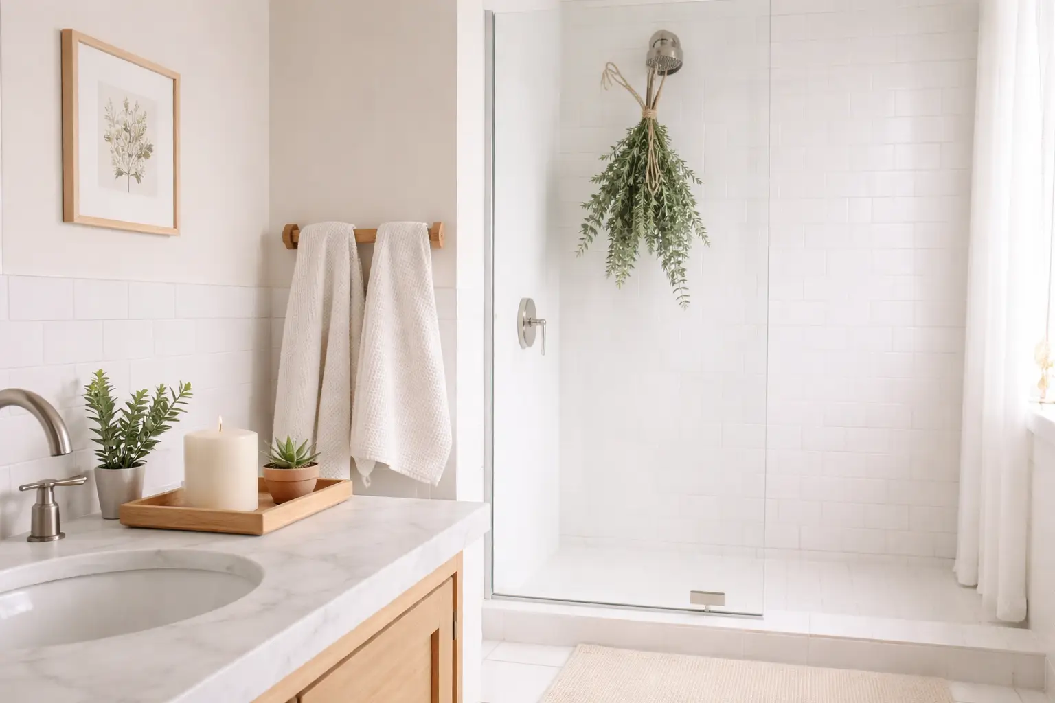
Spring bathroom trends continue their evolution into spa-inspired retreats. Even small bathrooms feel elevated with just a few thoughtful updates. A neutral spring bathroom refresh uses warm white and sandy linen towels replacing any brightly colored winter versions, a small eucalyptus bundle tied with natural twine hanging near the shower, a wooden tray on the vanity holding a cream candle and a small ceramic vessel with a stem or two, and a new cotton bath mat in warm white or pale sand. The spa-inspired neutral bathroom communicates spring through freshness and organic materials rather than seasonal color. Add a simple bench, a ceramic lamp, a pair of stools, or a vase of greenery to complete the look.
Wabi-Sabi Philosophy for Beautifully Imperfect Neutral Decor
Whether you are embracing the soft, sun-kissed glow of butter yellow or the grounded, soulful texture of warm woods, this spring is all about creating a home that reflects your personal journey. By mixing timeless philosophies like Wabi-Sabi with modern techniques, you can curate a space that feels both high-end and deeply comfortable. Wabi-Sabi, the Japanese philosophy of finding beauty in imperfection and transience, is the most intellectually coherent foundation available for a neutral spring decor approach. It celebrates the uneven glaze of a handmade ceramic, the slightly irregular weave of a natural textile, the natural crack in a wooden surface, and the organic imperfection of a dried botanical stem. Every Wabi-Sabi object contributes warmth and authenticity to a neutral interior that a perfectly manufactured object simply cannot replicate. Choose handmade over mass-produced wherever possible in your neutral spring decor.
Edit Back Ruthlessly for the Most Impactful Neutral Spring Look
During spring, we move on to things that feel lighter in tone and in feeling, celebrating this season of natural growth by swapping heavy decor pieces for fewer, lighter ones. The most powerful neutral spring decor move available requires no shopping at all. Remove half the objects from every surface in the room. Pack away the heaviest and darkest winter pieces. Leave generous empty space on every shelf and every table surface. The strongest spring decor trends are less about adding more objects and more about making a room feel lighter with fewer, better choices. The remaining objects, whatever they are, will read more clearly and more beautifully against the breathing room you have created around them. A single cream ceramic vase with one stem on a completely clear shelf communicates the neutral spring aesthetic more eloquently than an entire shelf of carefully chosen objects arranged without space.
Pulling the Neutral Spring Decor Look Together
The neutral spring home is built on three foundational decisions: a warm neutral color palette across every room rather than a different accent for each, a consistent preference for organic and natural textures over manufactured and synthetic ones, and a disciplined approach to editing that removes more than it adds. Sometimes spring decor is not about adding more. It is about editing back and letting the room exhale. Keep these three principles in mind as you implement the 16 ideas in this guide and the result will be a home that feels genuinely soft, genuinely serene, and genuinely spring in the most understated and sophisticated way available.
Conclusion
The softer spring look is not a compromise. It is a choice. It is the choice to prioritize atmosphere over announcement, texture over color, and restraint over abundance. This spring, interiors are embracing a softer, more storied sensibility, one that favors warmth over stark minimalism and craftsmanship over trend-driven novelty. The 16 neutral spring decor ideas in this guide collectively demonstrate that a home can feel completely transformed by the season without a single brightly colored object anywhere in it. Choose the ideas that suit your space and your instincts, implement them with the editing discipline that neutral decor demands, and discover how profoundly a softer look can change the way your home feels every day.
Frequently Asked Questions
What is neutral spring decor?
Neutral spring decor is a seasonal approach to home styling that introduces the freshness and organic energy of spring through warm neutral color palettes, natural textures, and organic materials rather than through bright seasonal colors or overtly themed decorations. Creamy off-whites, pale sand, soft taupe, and gentle greige are colors that reflect light beautifully and create a serene backdrop. The defining characteristic of neutral spring decor is its ability to feel genuinely seasonal without relying on any color outside the warm neutral family. It suits homes that want the atmosphere of spring without the visual noise of a fully color-accented seasonal refresh.
What neutral colors work best for spring home decor?
Muted mauves and earthy green tones, particularly pine and olive, anchored by warm browns and soft creams, are neutrals that can create a calming foundation for spring decor. Butter yellows and other gentle spring hues can be layered in as seasonal accents. Warm white, pale sand, soft taupe, warm greige, muted dusty pink, and olive and pine green are the six neutral colors most consistently recommended for spring home decor in 2026. The key to using them effectively is keeping all of them within the same warm undertone family so that the overall palette reads as cohesive and intentional rather than assembled from unrelated choices.
How do I make my home feel like spring without using color?
Natural materials, soft neutrals, and meaningful details bring their own lightness. Let texture carry the look. Spring decor does not have to be pastel to feel fresh. Replace heavy winter textiles with linen and cotton in warm neutrals. Add bare branch arrangements in clear glass vases. Swap winter candle fragrances for spring profiles such as fresh linen, green fig, and white tea. Introduce natural woven textures through rattan and seagrass objects. Edit back the number of objects on every surface to create breathing room. Each of these changes shifts the atmosphere of the home toward spring through material and sensory qualities rather than through color.
What textures define a neutral spring interior in 2026?
Expect to see a lot of rattan, wicker, and seagrass this season. In keeping with the theme of spring growth and renewal, pairing these textures with accent pieces inspired by nature can evoke a popular coastal-chic aesthetic. Washed linen, loosely woven cotton, unglazed terracotta, natural rattan and seagrass weaves, raw and warm-toned wood, handmade ceramics with irregular glazing, and smooth river stones are the eight textures most consistently associated with a neutral spring interior in 2026. The most sophisticated neutral spring interiors use at least four of these textures in a single room, creating visual depth through material contrast rather than color contrast.
Is neutral spring decor suitable for small homes and apartments?
In compact homes, the safest approach is usually one spring focal wall instead of many decorative touches. That matches the broader 2026 move toward more edited interiors. A wall can change the mood without taking floor or shelf space. Neutral spring decor is particularly well-suited to small homes and apartments because its foundational principle of editing back and creating breathing room actively improves the perception of space. A small apartment that removes its heaviest winter objects and replaces them with two or three carefully chosen neutral spring elements will feel significantly larger and lighter than it did in winter. The restrained approach that defines neutral spring decor is an advantage in compact spaces rather than a limitation.